The Fascinating World of Fonts
San Serif Serif. Fonts are more than just letters on a page; they are the visual representation of language, conveying emotions, branding, and information. Among the diverse types of fonts available, two categories often spark debate and discussion: san serif and serif fonts. Understanding these two styles is crucial for anyone involved in design, branding, or even just casual writing.
Understanding Serif Fonts
Serif fonts are characterized by the small lines or strokes regularly attached to the end of a larger stroke in a letter or symbol within a particular font. These embellishments, known as serifs, can be seen in popular typefaces like Times New Roman, Georgia, and Garamond. The origin of serif fonts can be traced back to ancient Roman inscriptions, where they were initially created to add elegance and readability to the text.
Historical Background of Serif Fonts
The history of serif fonts is rich and varied, dating back thousands of years. The Romans used chisel tools to carve letters into stone, and the serifs emerged as a natural consequence of the carving technique. Over time, different cultures adapted these styles, leading to the diverse range of serif fonts we see today. For example, during the Renaissance, printers in Italy began developing typefaces that would later influence modern serif fonts.
Characteristics of Serif Fonts
- Readability: Serif fonts are often considered more readable in printed works, particularly in long texts. The serifs guide the reader’s eye along lines of text, creating a smoother reading experience.
- Formality: Serif fonts often convey a sense of tradition and authority. This makes them a popular choice for academic papers, newspapers, and formal documentation.
- Variety: Serifs come in various styles, including slab serifs, which have thick, block-like serifs, and modern serifs, which are more streamlined and elegant.
Popular Serif Fonts
Some of the most widely recognized serif fonts include:
- Times New Roman: A classic serif font often used in newspapers and books.
- Georgia: Designed for clarity on computer screens, making it a favorite for web content.
- Garamond: Known for its elegance and readability, often used in printed books.
The World of San Serif Fonts
In contrast to serif fonts, san serif fonts lack the small projecting features at the ends of strokes. This absence of serifs gives them a cleaner and more modern appearance. Popular san serif fonts include Arial, Helvetica, and Futura. The term ‘san serif’ itself comes from the French word ‘sans’, meaning ‘without’.
Historical Background of San Serif Fonts
San serif fonts emerged in the early 19th century, initially as a reaction against the ornate styles of serif fonts. The first documented use of a san serif typeface was in the 1816, with the introduction of the font ‘Akzidenz-Grotesk’. This marked a shift towards simplicity in typography, which paralleled broader movements in art and design, such as Modernism.
Characteristics of San Serif Fonts
- Modernity: San serif fonts are often viewed as more contemporary and minimalistic, making them a popular choice for tech companies and startups.
- Legibility: They are typically easier to read on screens, which is why they dominate digital platforms.
- Simplicity: The absence of serifs contributes to a clean, straightforward look that many designers prefer.
Popular San Serif Fonts
Some notable san serif fonts include:
- Arial: One of the most widely used fonts, especially in digital contexts.
- Helvetica: Renowned for its neutrality and versatility in branding and advertising.
- Futura: A geometric sans serif font known for its modern and aesthetic appeal.
Best Sans Serif Fonts
Sans serif fonts are known for their clean lines and modern appeal. Choosing the best sans serif fonts can give your designs a contemporary and elegant look. Below is a selection of top sans serif typefaces, each with its unique style and ideal uses, to elevate your creative projects.
Hipo Font
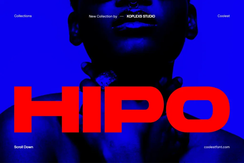
Hipo Font is a bold sans serif typeface crafted for modern designers who want impact and elegance in one package. It features confident shapes and clean lines, making it ideal for logos, posters, and high-end branding projects. Incorporate Hipo into your designs to give them a strong, cool, and elegant presence that truly stands out.
Gencha Font
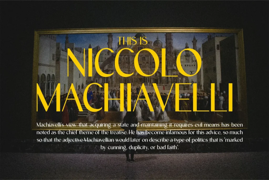
Gencha Font is a modern sans serif with clean lines and refined shapes, designed to bring elegance, clarity, and style to any project. It works perfectly for branding, logos, cosmetics packaging, fashion campaigns, and even editorial layouts, delivering smooth readability with a touch of luxury. Use Gencha to elevate your designs with a sophisticated, professional flair that captures attention.
Barytons Font
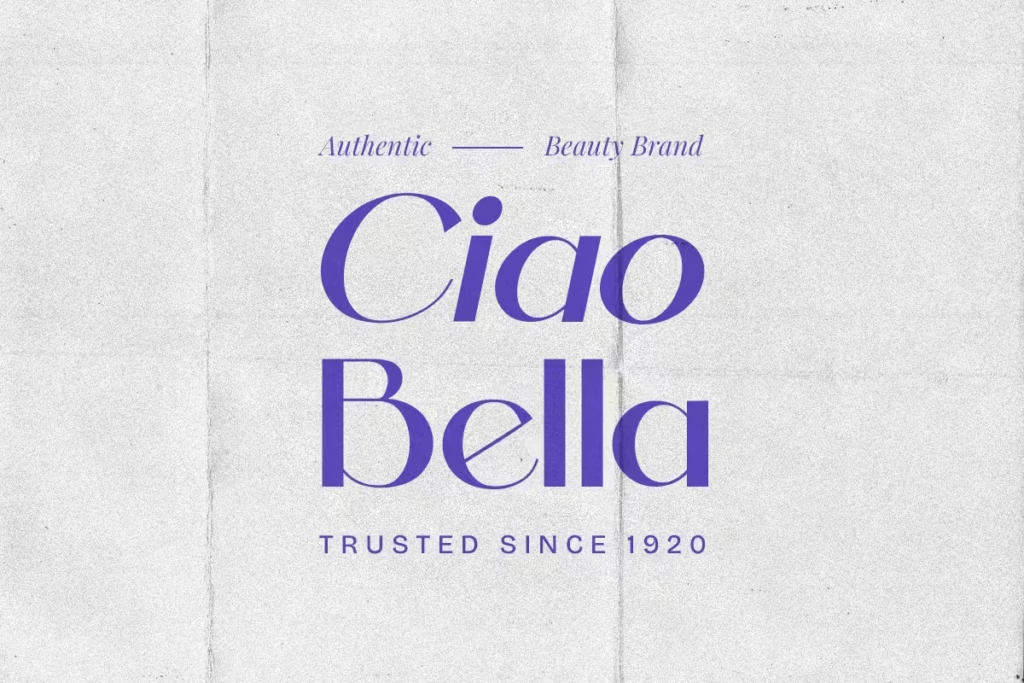
Barytons Font is a clean and contemporary sans serif designed to bring simplicity and elegance to your creative work. With its sleek, geometric letterforms, Barytons is a perfect fit for branding projects, editorial design, logos, web headers, and more. It comes in both Regular and Italic styles, providing flexibility for strong typographic contrast while keeping designs consistent and professional. Choose Barytons to infuse your projects with a harmonious blend of functionality and sophistication.
Masku Font

Masku Font is a bold, eye-catching display sans serif designed to make a statement in any design. Its strong, chunky letterforms with smooth geometric shapes give headlines, posters, logos, and packaging a modern look that captures attention instantly. This typeface is perfect for projects needing a distinctive and memorable touch – using Masku will instantly add a bold, contemporary vibe that elevates your work.
Saloums Font
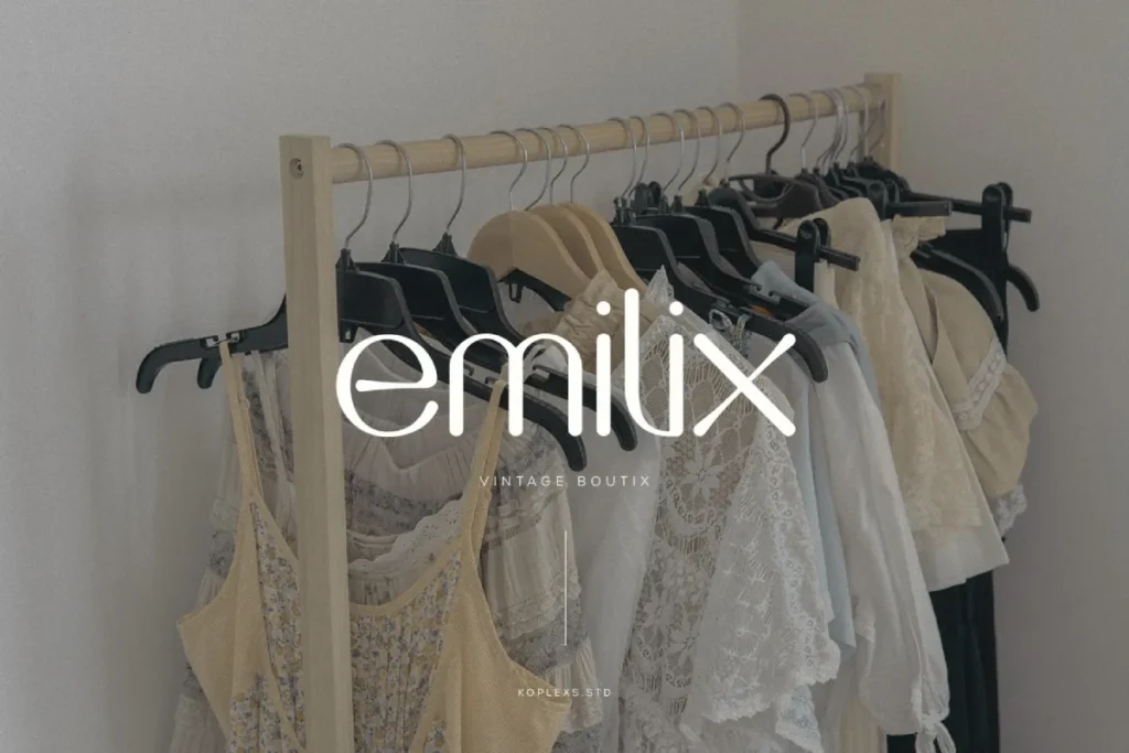
Saloums Font is a sophisticated sans serif display typeface that blends elegance with modern design, perfect for branding, event invitations, and editorial projects. Featuring 54 alternates and 26 ligatures, it offers plenty of creative flexibility, and its high readability makes it suitable for both striking headlines and longer text. With refined curves and balanced proportions, Saloums will give your designs an elegant yet versatile touch, helping them look polished and unique.
Cofigra Font

Cofigra Font whispers elegance with its delicate curves and refined serifs, evoking a sense of timeless sophistication and understated luxury. This modern serif display font adds a classy, upscale vibe to any project and is perfect for upscale branding, logos, invitations, book covers, or anything that needs a touch of graceful artistry. Use Cofigra to give your designs a luxurious, memorable aesthetic that sets them apart.
Hypogea Font
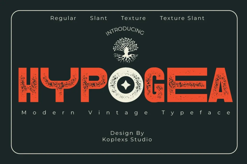
Hypogea Font is a bold and striking sans serif display typeface that blends vintage retro charm with modern style for a truly timeless feel. It comes in four versatile styles (Regular, Texture, Slant, and Texture Slant), giving you flexibility for eye-catching logos, posters, labels, packaging, and branding projects seeking a strong, authentic look. Whether you’re creating a modern logo or a nostalgic poster, Hypogea adds impactful personality and authenticity that will make your project stand out.
Conclusion
Each of these sans serif fonts offers a unique style, from Hipo’s bold modern flair to Cofigra’s elegant sophistication, covering a wide range of design needs. By focusing on their individual strengths and ideal uses, you can choose the perfect typeface to enhance your project’s visual impact. Leveraging one of these best sans serif fonts in your designs will not only improve readability and aesthetics but also help your work make a memorable impression.
Comparing Serif and San Serif Fonts
When choosing between serif and san serif fonts, there are several factors to consider. The decision often comes down to the context in which the font will be used, the audience it will reach, and the overall message it aims to convey.
| Criteria | Serif Fonts | San Serif Fonts |
|---|---|---|
| Readability in Print | Highly readable, especially in long texts | Less preferred in print, but effective in headers |
| Readability on Screens | Can be less legible on low-resolution displays | Highly legible and preferred for digital content |
| Formality | Conveys tradition and authority | Conveys modernity and minimalism |
| Use Cases | Books, newspapers, academic papers | Websites, advertisements, tech branding |
The Impact of Font Choice on Branding
The choice between serif and san serif fonts can significantly impact a brand’s identity. Fonts serve as a visual representation of a brand’s personality and values. For example, a luxury brand might opt for an elegant serif font to convey sophistication, while a tech startup might choose a sleek san serif font to represent innovation and modernity.
Case Studies: Brand Identity Through Fonts
Many well-known brands have carefully selected their fonts to align with their brand identity:
- Coca-Cola: Uses a script font that evokes nostalgia and tradition, appealing to its long history.
- Google: Utilizes a san serif font that reflects its modern, user-friendly approach to technology.
- New York Times: Employs a classic serif font to convey authority and reliability in news reporting.
The Psychology of Fonts
Fonts do not just communicate words; they also convey emotions and perceptions. Research has shown that different fonts can evoke different psychological responses from readers.
Emotional Responses to Serif and San Serif Fonts
Studies indicate that:
- Serif fonts often evoke feelings of trust and reliability. This is why they are commonly used in formal documents and institutions.
- San serif fonts tend to convey a sense of modernity and simplicity, appealing to younger audiences and tech-savvy consumers.
Choosing the Right Font for Your Audience
Understanding the emotional impact of fonts can help designers select the right typeface for their target audience. For instance, if a brand aims to appeal to a younger demographic, a playful san serif font might be more effective than a traditional serif font.
Conclusion
In conclusion, the exploration of san serif serif fonts reveals a fascinating interplay between design, functionality, and psychology. Choosing the right font can greatly influence how your message is received, whether in print or digital formats. As you embark on your typographic journey, consider the unique qualities of both serif and san serif fonts, and leverage their strengths to create compelling, effective designs. Remember, the font you choose is not just a stylistic choice; it is a crucial element of your brand’s identity and communication strategy. Embrace the power of typography!
Frequently Asked Questions
What is the main difference between serif and san serif fonts?
The main difference lies in the presence of serifs; serif fonts have small lines at the ends of strokes, while san serif fonts do not.
When should I use serif fonts?
Serif fonts are ideal for printed materials, formal documents, and when a sense of tradition or authority is needed.
Are san serif fonts better for digital use?
Yes, san serif fonts are generally easier to read on screens and are preferred for web content.
Can I mix serif and san serif fonts in my designs?
Absolutely! Mixing fonts can create visual interest, but it’s essential to maintain a cohesive style.
What are some popular san serif fonts for web design?
Some popular san serif fonts include Arial, Helvetica, and Open Sans, known for their clarity and versatility.
Do fonts affect conversion rates on websites?
Yes, the right font can significantly impact user experience and conversion rates, making font choice crucial for web design.
How do I choose the right font for my brand?
Consider your brand identity, target audience, and the emotions you wish to convey when selecting a font.
