The Evolution of Typography: From Serif to Sans and Beyond
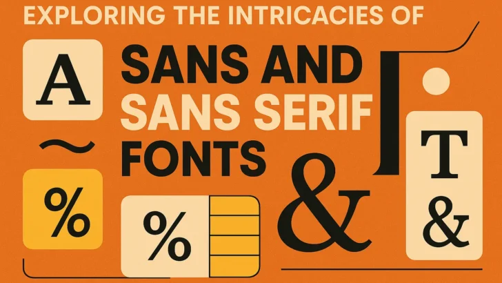
Sans and Sans Serif Fonts. Typography is an art form that has evolved significantly over centuries, with a rich history that influences how we communicate visually today. One of the most significant developments in this realm is the distinction between serif and sans serif fonts. While serif fonts are characterized by their small lines or decorative strokes at the ends of letters, sans serif fonts lack these embellishments, leading to a cleaner and more modern appearance. The term ‘sans’ originates from French, meaning ‘without,’ which perfectly encapsulates the essence of sans serif typefaces.
Understanding the evolution of these font categories is crucial. Serif fonts, which date back to the Roman typefaces of the 15th century, were initially created to enhance readability in printed text. They were widely used in books and formal documents, lending a sense of authority and tradition. In contrast, sans serif fonts emerged in the early 19th century, gaining popularity during the Industrial Revolution when clarity and simplicity were paramount in advertising and signage.
Today, the debate between sans and sans serif continues, with each offering unique advantages depending on the context. For instance, while serif fonts might evoke a sense of formality and reliability, sans serif fonts often convey modernity and straightforwardness, making them ideal for digital media.
Read More : 25 Best Fonts for CD Covers That Elevate Album Style
Characteristics of Sans and Sans Serif Fonts
To truly appreciate the differences between sans and sans serif fonts, it’s essential to delve into their characteristics. Let’s explore the defining traits of each type:
- Serif Fonts:
- Decorative Elements: Serif fonts feature small lines or embellishments at the ends of their strokes, which can vary significantly between different typefaces.
- Readability: The serifs help guide the reader’s eye along the lines of text, which can enhance readability, especially in printed works.
- Classic Appeal: Serif fonts are often associated with tradition and authority, making them suitable for formal documents, books, and newspapers.
- Sans Serif Fonts:
- Clean Lines: Sans serif fonts are known for their clean and simple lines, lacking the decorative elements that characterize serif fonts.
- Modern Aesthetic: The absence of serifs gives these fonts a contemporary feel, making them popular in branding, websites, and digital interfaces.
- Versatility: Sans serif fonts can be used in various contexts, from headings to body text, due to their readability at different sizes.
Understanding these characteristics is vital for designers and typographers, as the choice of font can significantly impact the overall message and aesthetic of a project.
Read More : Script Alphabet Fonts for Stunning Creative Designs
The Role of Sans and Sans Serif Fonts in Modern Design
In the contemporary design landscape, sans and sans serif fonts play a pivotal role in shaping brand identities and enhancing user experiences. As digital platforms become increasingly dominant, the choice of typography is more critical than ever. Here are some ways in which these fonts influence modern design:
Brand Identity
Brands carefully select their typography to convey specific messages and values. For instance:
- Tech Companies: Many tech brands, such as Google and Apple, utilize sans serif fonts to project a sense of innovation and simplicity. The clean lines of these fonts align with their emphasis on user-friendly technology.
- Luxury Brands: Conversely, some high-end brands may choose serif fonts to evoke a sense of tradition and sophistication. This contrast highlights the nuanced way typography affects consumer perception.
User Experience in Digital Media
Typography directly impacts user experience on websites and apps. Research shows that:
- Readability: Sans serif fonts are often easier to read on screens, particularly at smaller sizes. This is crucial for ensuring that users can effortlessly consume content.
- Hierarchy: Designers often use a combination of serif and sans serif fonts to create a visual hierarchy, guiding users through the content effectively.
Accessibility Considerations
When selecting fonts, designers must also consider accessibility. Some key points include:
- Choice of Font Size: Sans serif fonts are typically easier to read at smaller sizes, making them a preferable choice for body text in digital formats.
- Contrast and Background: The choice of font should complement the background color to ensure legibility for all users, including those with visual impairments.
In this digital age, the interplay between sans and sans serif fonts shapes how brands communicate and how users interact with content, making typography a fundamental aspect of design.
Read More : Sans Serif Popular Fonts for Modern Design Trends
Choosing the Right Font: Factors to Consider
Selecting between sans and sans serif fonts is not just a matter of personal preference; it requires a thoughtful approach that considers various factors. Here are some essential considerations:
Target Audience
Your target audience plays a significant role in font selection. Consider the following:
- Demographics: Younger audiences may respond better to the modern look of sans serif fonts, while older demographics might prefer the traditional appeal of serif fonts.
- Industry Norms: Certain industries have established norms regarding typography. For instance, legal and financial firms often gravitate towards serif fonts for their authoritative connotations.
Medium of Communication
The medium through which your message is conveyed also influences font choice:
- Print vs. Digital: Serif fonts may be more effective in print materials due to their readability, while sans serif fonts excel in digital formats.
- Size and Scale: Consider how the font will appear at different sizes. Sans serif fonts maintain their clarity even when scaled down, making them suitable for mobile applications.
Brand Personality
Your brand’s personality should shine through in your typography choices:
- Casual vs. Formal: If your brand aims for a friendly and approachable image, sans serif fonts may be more suitable. In contrast, a more formal brand might lean towards serif fonts.
- Consistency: Ensure that your font choices align with your overall branding strategy for a cohesive visual identity.
By taking these factors into account, designers can make informed decisions that align typography with the overall goals of a project.
Read More : Best Font for Scripts That Elevate Your Design
Real-World Examples of Sans and Sans Serif Fonts
To illustrate the impact of sans and sans serif fonts, let’s examine some real-world applications across various industries:
Corporate Branding
Many well-known brands have harnessed the power of typography to establish their identities:
- IBM: The classic IBM logo uses a bold sans serif font, projecting strength and reliability, which is essential for a technology company.
- Coca-Cola: In contrast, Coca-Cola employs a script font with serifs in its logo, evoking nostalgia and tradition, aligning with its heritage.
Web Design
Websites often utilize a combination of both font types for enhanced user experience:
- Medium: This blogging platform uses a serif font for headlines and a sans serif font for body text, creating a balance between elegance and readability.
- Amazon: Amazon’s website predominantly features sans serif fonts, providing clarity and ease of navigation for users.
Advertising and Marketing
Typography significantly influences advertising campaigns:
- Airbnb: Their branding employs a sans serif font, reflecting a modern and welcoming ethos that appeals to a diverse audience.
- New York Times: The newspaper uses serif fonts throughout its pages, enhancing readability and maintaining its authoritative voice.
These examples underscore the importance of typography in shaping brand perception and user experience, demonstrating how the choice between sans and sans serif can have far-reaching implications.
Read More : Best Fonts for Tattoo Names to Express Your Personal Style
Popular Sans and Sans Serif Fonts: A Comparative Overview
In the world of typography, certain sans and sans serif fonts have gained immense popularity due to their versatility and aesthetic appeal. Below is a comparative overview of some widely used fonts in each category:
| Font Name | Type | Characteristics | Best Use Cases |
|---|---|---|---|
| Helvetica | Sans Serif | Neutral and versatile, clean lines | Logos, signage, web design |
| Arial | Sans Serif | Simple and legible, widely available | Print and digital media |
| Times New Roman | Serif | Classic, traditional, high readability | Books, newspapers, formal documents |
| Georgia | Serif | Elegant, designed for clarity on screens | Web content, blogs, articles |
| Open Sans | Sans Serif | Friendly, approachable, high legibility | Web design, user interfaces |
| Garamond | Serif | Stylish, timeless, excellent for print | Books, invitations, formal writing |
This comparative overview illustrates the diverse range of sans and sans serif fonts available to designers, each with its unique characteristics and best use cases.
Recommended Professional Serif Fonts for Design and Branding
Dasko Font
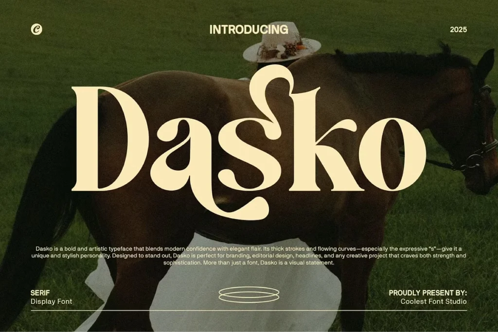
Dasko Font is a modern serif typeface with strong contrast and clean proportions, making it suitable for editorial layouts, branding, and premium visual identities. Its sharp details give a confident and authoritative impression, while the balanced letterforms maintain readability across print and digital media. Designers looking to enhance brand credibility can start integrating this font into their next creative project to achieve a polished look.
Gantic Font
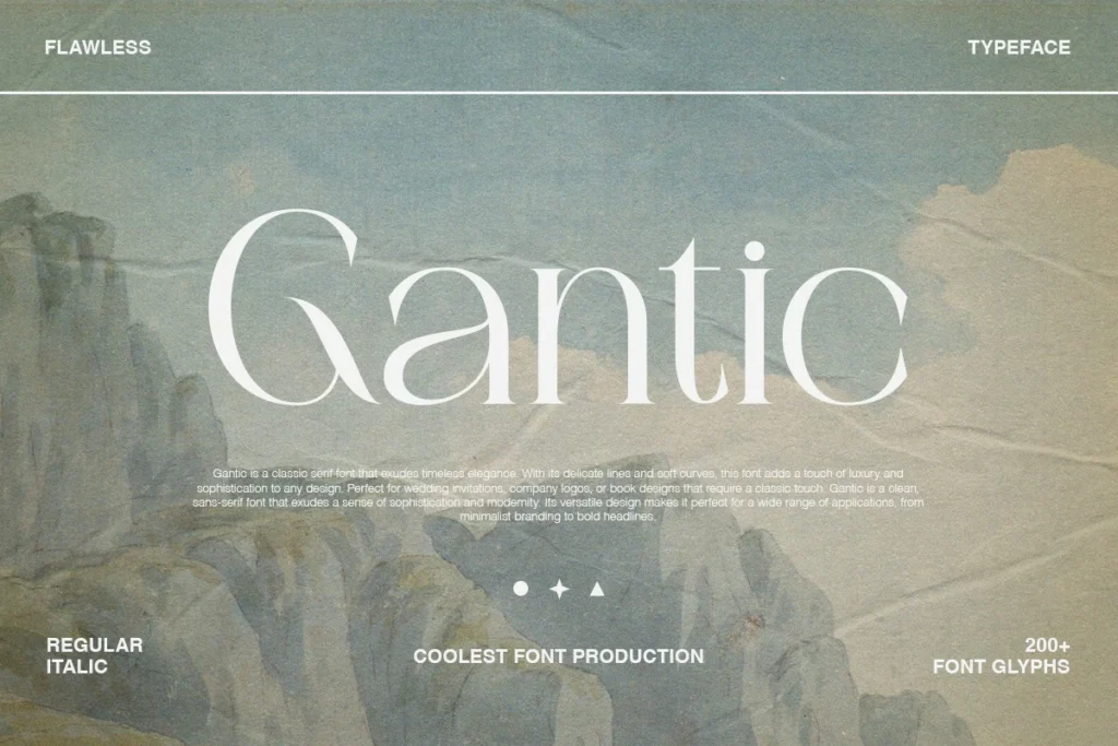
Gantic Font delivers a serif style with a contemporary edge, ideal for headlines, logos, and impactful marketing materials. The font combines classic serif structure with modern geometry, allowing designers to experiment with expressive layouts. By applying Gantic Font in your design workflow, you can quickly create visuals that stand out and communicate strength.
Vocare Font
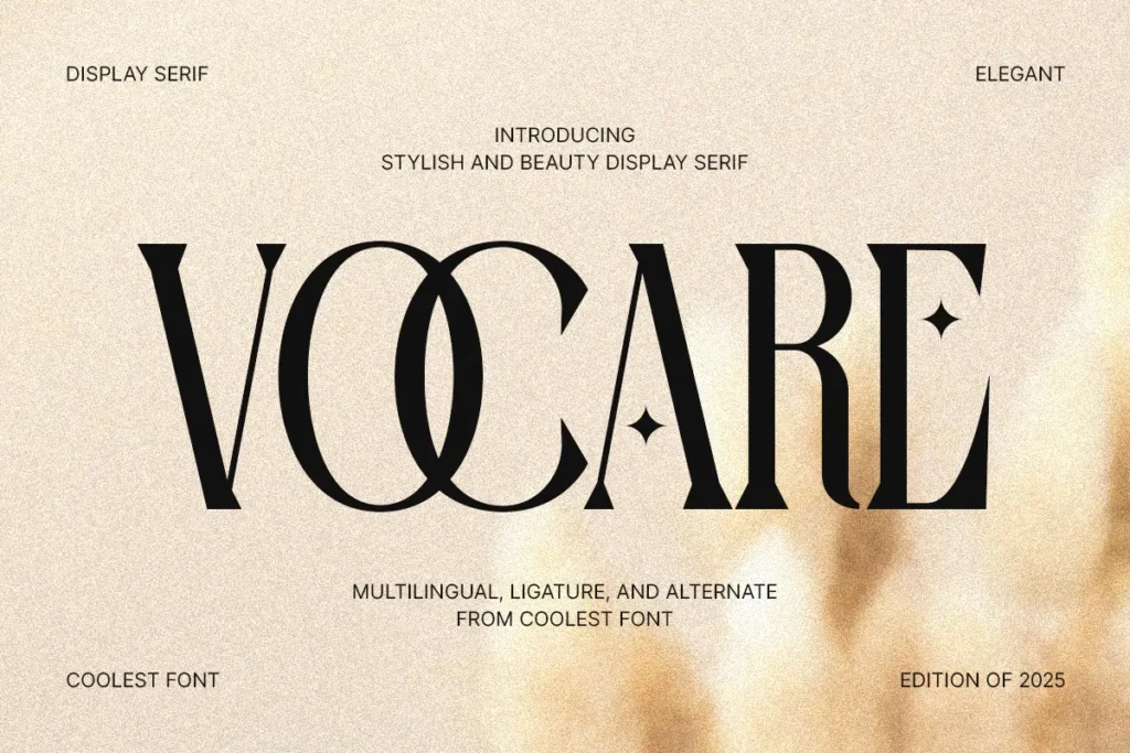
Vocare Font offers an elegant serif design inspired by classic typography with refined curves and smooth strokes. It works especially well for book covers, magazines, and luxury branding projects. When designers want to add a sense of sophistication and timeless character, this font can be explored to enrich visual storytelling.
Sagalie Font
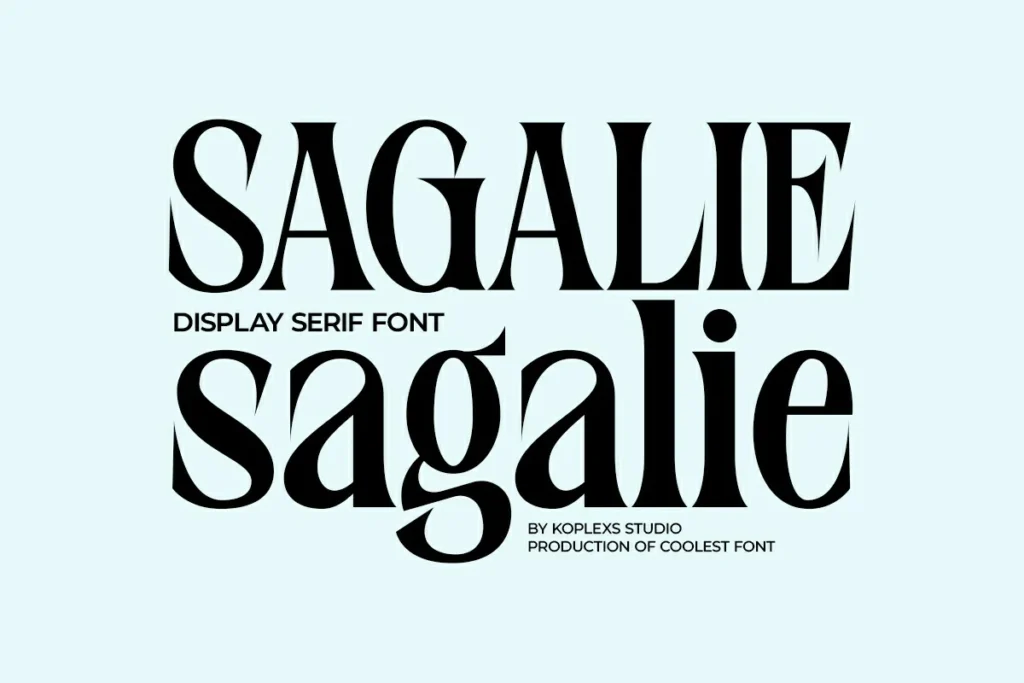
Sagalie Font is a stylish serif typeface with artistic flair, making it perfect for creative branding and display purposes. Its unique character shapes add personality without sacrificing legibility. Using this font in visual concepts can help designers build distinctive identities that feel both creative and professional.
West Advega Font
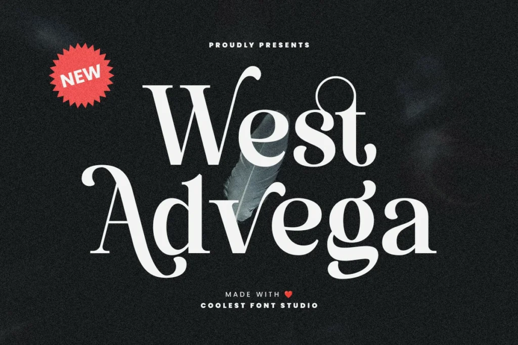
West Advega Font presents a modern inspired serif style with bold details and strong presence. It is highly suitable for posters, editorial headlines, and classic themed designs. Designers aiming to evoke heritage and authenticity can incorporate this font to strengthen visual impact early in the design process.
Maista Font
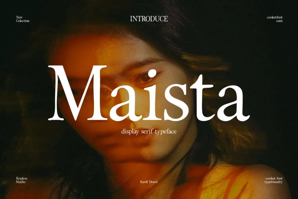
Maista Font is a graceful serif font with smooth transitions and balanced proportions. It fits well in fashion branding, invitations, and editorial design. When applied thoughtfully, this font can help convey elegance and refinement while maintaining clarity across various design formats.
Domina Font
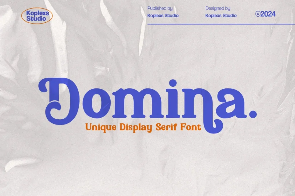
Domina Font features a powerful serif structure with sharp terminals and confident strokes. It is designed to perform well in branding, headlines, and professional presentations. Designers seeking a strong visual voice can begin using this font to emphasize authority and trust in their layouts.
Amoveno Font
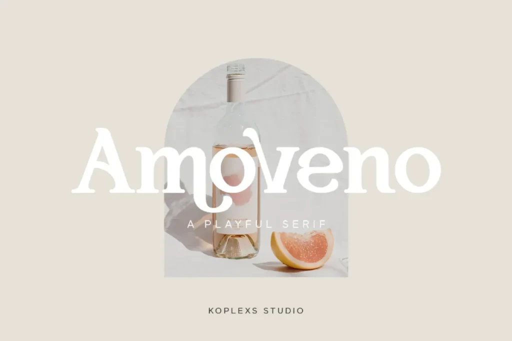
Amoveno Font combines modern serif aesthetics with subtle decorative touches. This makes it ideal for lifestyle branding, creative projects, and premium packaging. Exploring this font within branding concepts can help create warm yet sophisticated visual impressions.
Champers Font
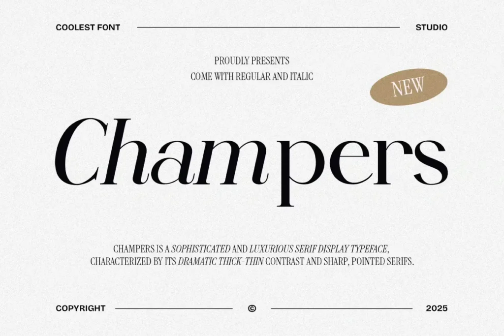
Champers Font delivers a playful yet elegant serif style that feels expressive and stylish. It works well for branding, editorial highlights, and creative campaigns. Designers can integrate this font into their visual systems to add charm and personality while keeping a professional tone.
Charquid Font
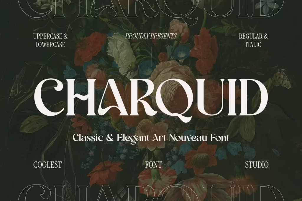
Charquid Font is a bold serif typeface with artistic curves and strong contrast. It is suitable for logos, headlines, and statement driven designs. By experimenting with this font in display typography, designers can quickly capture attention and enhance brand memorability.
Cosity Font
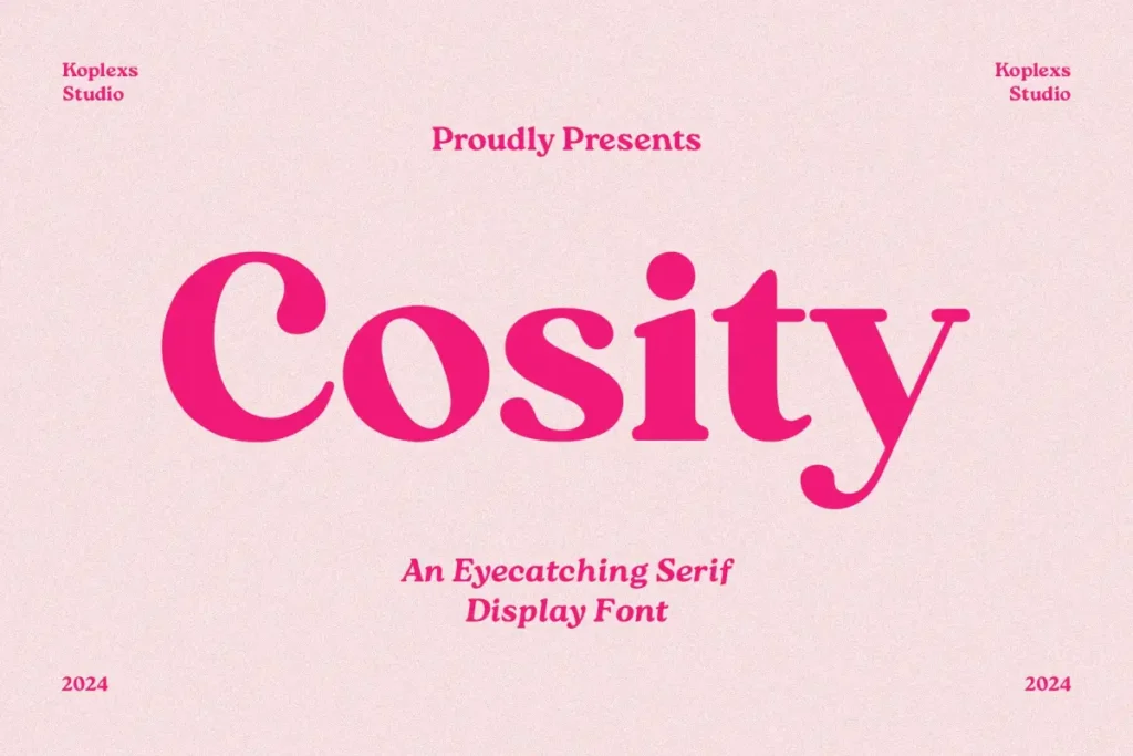
Cosity Font offers a soft serif appearance with friendly proportions and smooth edges. It is ideal for branding, packaging, and editorial content that requires a warm and approachable feel. Applying this font early in design concepts can help communicate comfort and reliability.
Garo Font
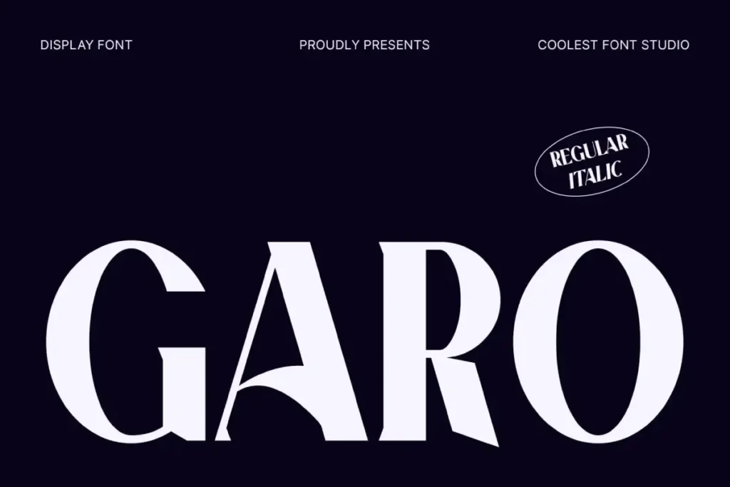
Garo Font features a classic serif foundation with a modern refinement, making it versatile for both print and digital use. It works well for corporate branding, editorial layouts, and presentations. Designers can rely on this font to create professional visuals with timeless appeal.
Proten Font
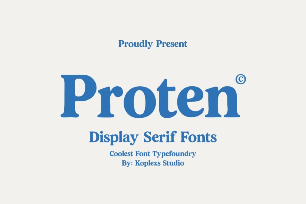
Proten Font is a strong and structured serif font designed for clarity and impact. Its clean lines and bold presence make it suitable for headlines and branding materials. Incorporating this font into design systems allows for consistent and confident visual communication.
Palmer Sorjan Font
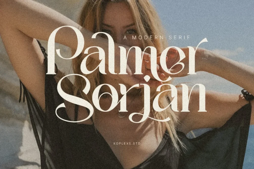
Palmer Sorjan Font blends vintage serif characteristics with contemporary styling. It is ideal for branding, posters, and editorial designs that seek a nostalgic yet modern look. Designers exploring visual storytelling can use this font to reinforce character and depth in their projects.
Amgior Font
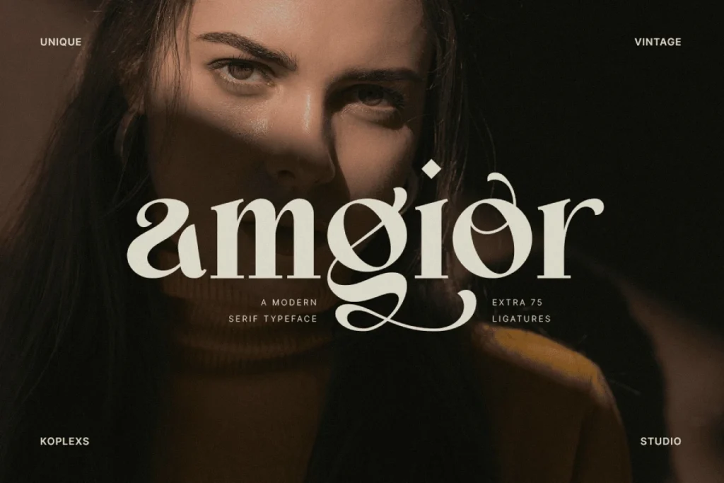
Amgior Font showcases an elegant serif style with refined details and balanced letterforms. It is suitable for luxury branding, editorial design, and creative typography. Using this font thoughtfully can help elevate design aesthetics and create a premium visual experience.
All of the serif font recommendations above offer different characters, ranging from classic, modern, to artistic. Each font has its own advantages that can be tailored to branding, editorial, and creative design needs. By choosing the right serif font, designers can strengthen visual identity, enhance credibility, and create a consistent professional impression on every project.
Read More : Finding a font for headline that elevates your brand
Recommended Sans Serif Font untuk Desain Modern dan Profesional
Hipo Font
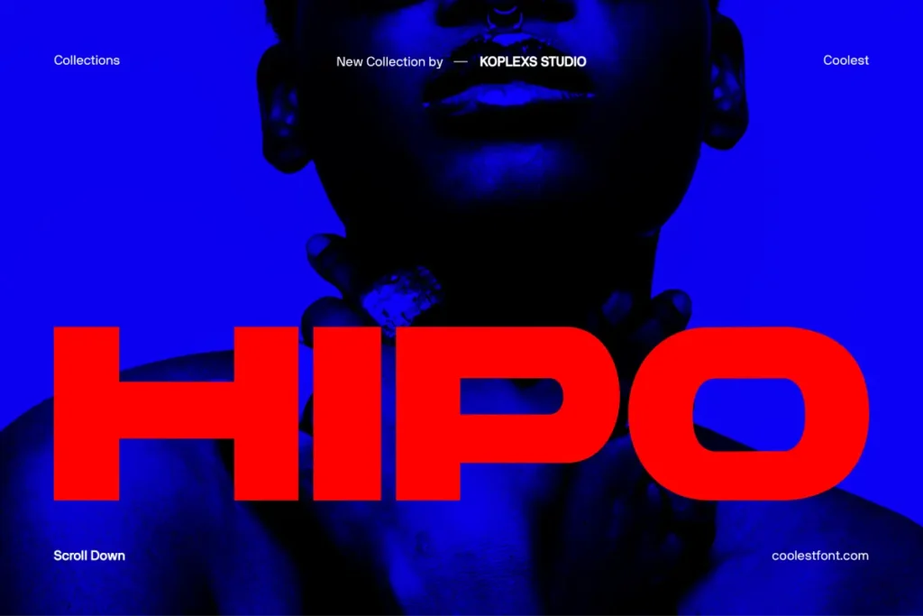
Hipo Font is a clean and contemporary sans serif typeface designed for clarity and versatility. Its balanced proportions make it suitable for branding, editorial layouts, and digital interfaces where readability is essential. By choosing Hipo Font, designers can strengthen visual identity while maintaining a professional and modern appearance across various media.
Gencha Font
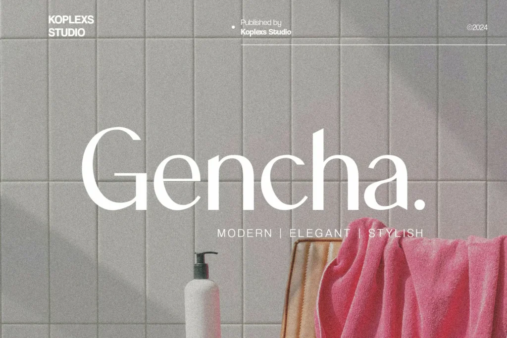
Gencha Font combines simplicity with a friendly character, making it ideal for creative projects that need a modern yet approachable tone. The smooth curves and consistent stroke widths help messages feel clear and engaging. This font works well for startups, lifestyle brands, and marketing materials that aim to build trust and connection with audiences.
Wrecks Font
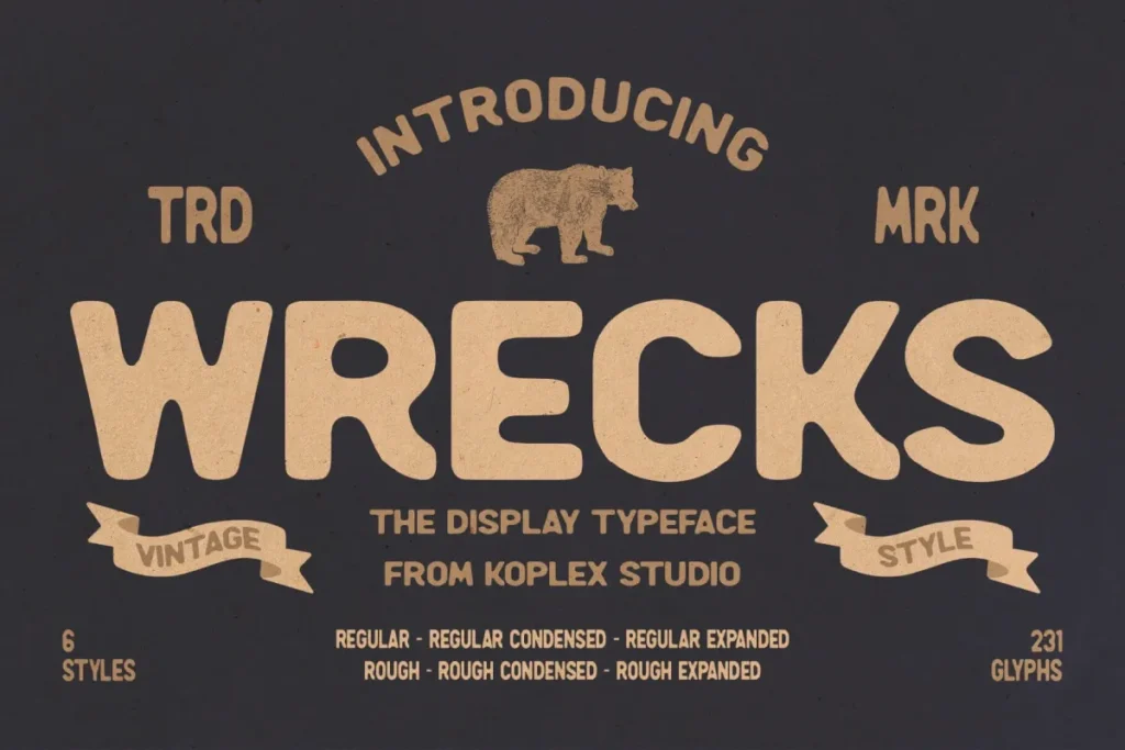
Wrecks Font delivers a bold and confident sans serif style that stands out in headlines and display text. Its strong shapes give designs a powerful presence without sacrificing legibility. Using Wrecks Font can help emphasize key messages and attract attention in posters, websites, and promotional graphics.
Cofigra Font
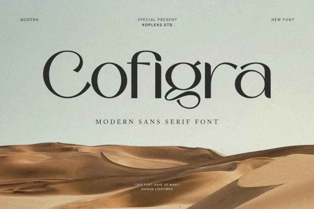
Cofigra Font offers a refined sans serif look with a minimalistic structure that supports elegant design concepts. It adapts easily to both print and digital formats, making it a reliable choice for corporate branding and clean layouts. Designers who value consistency and sophistication will find this font effective for long term visual systems.
Hypogea Font
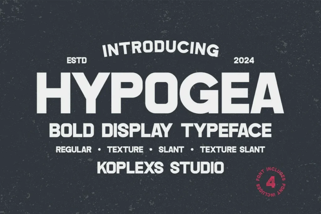
Hypogea Font features a modern geometric construction that feels futuristic and precise. The sharp details and stable forms make it suitable for technology focused brands and innovative design projects. Applying Hypogea Font can reinforce a forward thinking image while keeping text clear and structured.
Masku Font
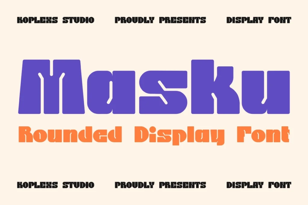
Masku Font is a versatile sans serif typeface with a neutral tone that fits a wide range of design needs. Its straightforward appearance allows content to take center stage, making it ideal for user interfaces, presentations, and editorial use. This font supports clear communication and professional consistency.
Saloums Font
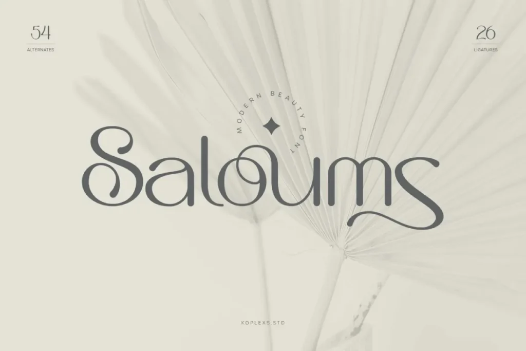
Saloums Font brings a unique personality to sans serif typography with subtle character details that enhance visual interest. It works well for creative branding, social media graphics, and modern publications. Designers can use Saloums Font to add distinction while maintaining readability and balance.
Moxin Font
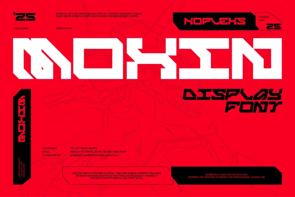
Moxin Font combines modern aesthetics with practical readability, making it suitable for both headlines and body text. The font feels dynamic yet controlled, helping designs look fresh and organized. Incorporating Moxin Font can elevate visual storytelling in branding and digital design projects.
Milek Font
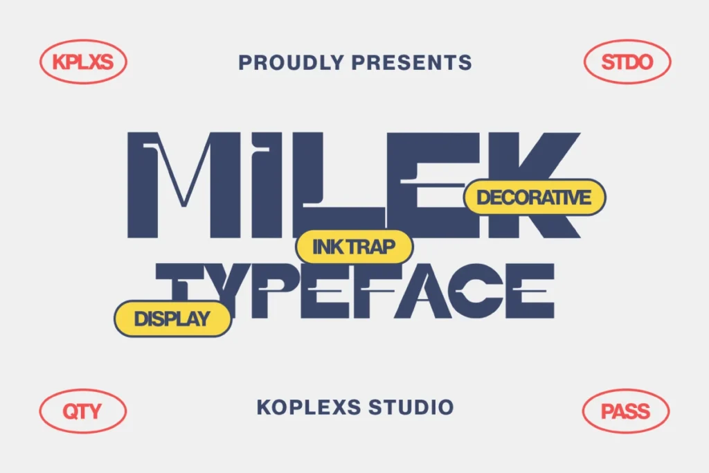
Milek Font offers a clean and approachable sans serif design that feels modern and friendly. Its balanced letterforms make it easy to read across different screen sizes and print formats. Designers can rely on Milek Font to create designs that feel professional, accessible, and visually consistent.
All of these recommended sans serif fonts provide strong foundations for modern design projects. Each font has its own character, ranging from bold and expressive to clean and minimal, allowing designers to choose based on branding goals and audience needs. By selecting the right sans serif font from this list, visual communication becomes clearer, more engaging, and better aligned with a professional design standard.
Read More : Find Which Font Easily with Smart Font Identifier Tools
Wrapping Up: The Power of Typography
In conclusion, the world of sans and sans serif fonts is vast and complex, offering a myriad of choices for designers and brands alike. Understanding the characteristics, applications, and implications of each type enables you to make informed decisions that enhance your projects. Typography is more than just aesthetic; it shapes communication, influences user experience, and ultimately, drives brand identity.
As you embark on your design journey, consider the power of typography and how your choices can resonate with your audience. Whether you opt for the classic elegance of serif fonts or the modern clarity of sans serif, remember that every font tells a story. Choose wisely to ensure that your message is conveyed effectively.
Ready to explore the world of typography further? Dive deeper into the nuances of font styles and discover the perfect typeface for your next project!
Frequently Asked Questions
What are the primary differences between sans and sans serif fonts?
The primary difference lies in the presence of serifs. Serif fonts have decorative lines at the ends of their strokes, while sans serif fonts do not, resulting in a cleaner and more modern appearance.
When should I use sans serif fonts over serif fonts?
Use sans serif fonts for digital media, where clarity and readability are paramount. Serif fonts are typically better suited for printed materials.
Can I mix sans and sans serif fonts in my designs?
Yes, mixing both can create a balanced and visually appealing design. Ensure that the fonts complement each other and maintain a cohesive overall look.
Are there any accessibility considerations when choosing fonts?
Yes, consider font size, contrast, and readability to ensure that your text is accessible to all users, including those with visual impairments.
What are some popular sans serif fonts?
Popular sans serif fonts include Helvetica, Arial, and Open Sans, each of which is widely used in various design contexts.
How do typography choices affect brand perception?
Typography can significantly influence how a brand is perceived. For example, serif fonts may convey tradition and authority, while sans serif fonts often suggest modernity and accessibility.
Is it essential to stick to one font family in a design project?
While consistency is important, using multiple fonts from the same family can add visual interest and hierarchy without compromising cohesion.
