Sans Serif Popular Fonts That Define Modern Design
Sans Serif popular fonts. Have you ever wondered why some designs instantly look modern, clean, and timeless? The secret often lies in the font choice. Sans serif fonts are known for their simplicity and readability, making them essential in contemporary branding, websites, and digital interfaces.
In this article, you will learn why sans serif popular fonts dominate visual communication, explore their history, understand what makes them appealing, and discover how to choose the right one for your project.
What Are Sans Serif Fonts and Why Are They So Popular
Sans serif fonts are typefaces without decorative strokes called serifs at the ends of letters. This gives them a clean and minimal appearance that feels fresh and modern.
Key Characteristics
-
Clarity: Easy to read both on screens and in print.
-
Versatility: Suitable for branding, advertising, and web design.
-
Modern Look: Represents innovation and simplicity.
According to a Forbes design report, brands that use sans serif typefaces are often viewed as more approachable and trustworthy, especially in digital contexts.
Classic and Timeless Sans Serif Fonts
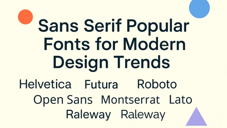
Some fonts remain timeless because of their enduring balance of form and function. Below are some of the most influential sans serif popular fonts.
Helvetica
Known as the king of sans serif fonts, Helvetica is famous for its professional and neutral design. It is used by major brands such as American Airlines, BMW, and Nestlé because of its legibility and universal appeal.
Best Use: Corporate branding, signage, editorial design.
Futura
Futura features geometric shapes and a modernist feel. Its clean, futuristic style makes it a favorite among tech brands and luxury packaging designers.
Best Use: High-end branding, packaging, technology visuals.
Avenir
Avenir combines geometric precision with warmth and humanism. It fits perfectly for digital products and modern projects.
Best Use: App design, websites, brand materials.
| Font | Style Type | Best Use Case | Notable Traits |
|---|---|---|---|
| Helvetica | Neo-grotesque | Branding, corporate | Neutral and versatile |
| Futura | Geometric | Tech, luxury | Modern and precise |
| Avenir | Humanist | Web, digital | Elegant and balanced |
Sans Serif Popular Fonts Digital and Web Sans Serif Fonts
With the growth of digital media, certain sans serif fonts have become standards in user interface and online readability.
Roboto
Created by Google for Android OS, Roboto blends geometry and friendliness. It is highly readable on any device.
Best Use: Mobile apps, UI design, websites.
Open Sans
A humanist sans serif optimized for screens, Open Sans ensures clarity even in small sizes.
Best Use: Blogs, business websites, and e-learning platforms.
Montserrat
Inspired by urban signage from Buenos Aires, Montserrat has a geometric and modern look that works beautifully for web headings and branding.
Best Use: Branding, website headers, digital campaigns.
Lato
Meaning “summer” in Polish, Lato feels warm and approachable. Its neutrality makes it suitable for both startups and established companies.
Best Use: Corporate identity, mobile design.
Poppins
This geometric font offers a wide range of weights and a simple structure. It is widely used by tech and fintech brands.
Best Use: Digital branding, apps, fintech visuals.
Inter
Designed specifically for digital products, Inter ensures excellent legibility thanks to its tall x-height and open letterforms.
Best Use: User interfaces, dashboards, and software.
Source Sans Pro
Developed by Adobe as its first open-source typeface, Source Sans Pro delivers a professional yet approachable feel.
Best Use: Technology companies, professional services.
| Font | Designed By | Ideal For | Key Strength |
|---|---|---|---|
| Roboto | UI and apps | Excellent readability | |
| Open Sans | Steve Matteson | Websites | Humanist design |
| Montserrat | Julieta Ulanovsky | Branding | Geometric elegance |
| Lato | Łukasz Dziedzic | Business | Friendly tone |
| Poppins | Indian Type Foundry | Tech brands | Modern and balanced |
| Inter | Rasmus Andersson | Interfaces | Clarity on screens |
| Source Sans Pro | Adobe | Corporate | Open-source reliability |
Other Notable Sans Serif Popular Fonts You Should Know
Here are five interesting sans serif fonts worth exploring beyond the usual suspects. Each brings its own unique flavour and utility for modern design contexts.
Hipo Font
Hipo is a clean sans serif with a strong presence and geometric structure. It features uniform stroke widths and open letterforms that make it suitable for bold headings and brand identity work.
Its modern aesthetic gives designs a confident and minimalist character.
Gencha Font
Gencha emphasizes clarity and simplicity. With well-balanced proportions and generous spacing, this font is built to perform in both print and digital media. Its subtle humanist undertones lend a friendly feel while maintaining professionalism.
Saloums Font
Saloums offers a slightly condensed sans serif style with refined letter shapes and good readability at various sizes. It’s particularly effective for editorial layouts, sub-headings, and signage where space is at a premium but style remains important.
Barytons Font
Barytons is a modern sans serif that leans slightly into geometric forms while retaining a human touch. It works well for display use and moderate-sized text. The balanced design of Barytons ensures your messaging looks stylish and readable.
Cofigra Font
Cofigra presents a sleek sans serif with a bit of edge. The letterforms are crafted for clarity and impact making it suitable for web headers, app UI and branding that demands a modern feel. Cofigra is designed to stand out without sacrificing legibility.
Bourne Font
Bourne has a refined and versatile look that sits somewhere between minimalism and character. With its clean lines and neutral tone it adapts easily to corporate branding, app interfaces and marketing materials where clarity is key.
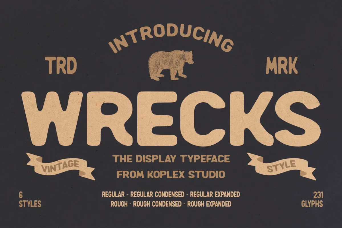
Wrecks Font
Wrecks brings a contemporary sans serif flavour with distinctive proportions and subtle quirks in some letters that give it personality while staying legible. This makes it a good choice for creative brands, tech startups or modern packaging design.
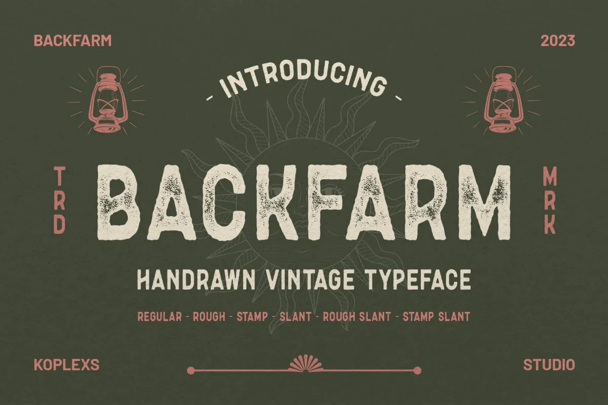
Backfarm Font
Backfarm is a sans serif choice that merges modern simplicity with subtle personality. Its uniform strokes and open counters make it a strong candidate for digital interfaces, editorial content and futuristic branding. Backfarm adds a refined twist to clean typography.
Why Designers Love Sans Serif Fonts
Designers across the world prefer sans serif fonts because they:
-
Improve readability across different devices and platforms.
-
Convey professionalism and trust.
-
Enhance minimal and modern layouts.
-
Adapt seamlessly to print and digital uses.
In today’s mobile-driven era, sans serif fonts are seen as future-ready design assets that combine beauty and function effectively.
How to Choose the Right Sans Serif Font for Your Brand
Selecting the right typeface can shape how people perceive your brand. Consider these factors:
-
Audience Perception: Choose friendly fonts such as Lato or Open Sans for approachable brands, and professional fonts like Helvetica for formal businesses.
-
Usage Medium: Fonts like Roboto and Inter perform best on digital screens, while Helvetica and Avenir excel in print.
-
Consistency: Pick a type family with multiple weights to maintain a cohesive brand identity.
-
Brand Voice: Tech-focused brands often prefer Futura or Poppins, while elegant labels lean toward Raleway or Avenir.
Pro Tip: Always test your chosen font across different screen sizes and browsers before finalizing it.
Tools and Resources to Explore Sans Serif Fonts
If you want to explore more sans serif popular fonts, here are some trusted resources:
-
Google Fonts: Free fonts like Roboto, Lato, and Montserrat.
-
Adobe Fonts: Premium options such as Avenir Next and Source Sans Pro.
-
FontPair.co: Helps you find harmonious font pairings.
-
Typewolf.com: Expert recommendations and real-world font usage examples.
Conclusion: The Enduring Simplicity of Sans Serif Fonts
In a world full of visual clutter, sans serif fonts prove that simplicity can be powerful. Whether you are designing a logo, developing a website, or crafting a presentation, these fonts help deliver clarity and modern elegance.
Choosing the right sans serif font can elevate your brand identity and make your message memorable. If you aim for timeless appeal and professional design, start with one of the sans serif popular fonts mentioned above.


