Sans Serif Typeface Font and Its Role in Modern Visual Design
Sans Serif Typeface Font. Have you ever noticed why most websites, mobile apps, and global brands look clean, modern, and effortless to read?
It is not an accident.
More than 90 percent of digital interfaces today rely on a sans serif typeface font. From tech startups to Fortune 500 companies, this font style has quietly become the visual language of the modern world.
In this article, you will understand what makes sans serif typeface font so powerful, how it influences perception, trust, and usability, and why designers, brands, and UX experts consistently choose it over other font styles.
If you care about readability, branding, and digital credibility, this is a topic you cannot ignore.
What Is a Sans Serif Typeface Font?
Understanding the Basic Definition
A sans serif typeface font is a font style that does not have decorative strokes or extensions at the ends of letters. These extensions are called serifs.
In simple terms:
- Serif fonts have small lines or feet
- Sans serif fonts are clean and plain
This simplicity is exactly what makes them so effective in modern design.
Visual Characteristics That Define Sans Serif Fonts
Sans serif fonts are recognizable because they usually feature:
- Clean and straight letterforms
- Uniform stroke width
- Minimal contrast between thick and thin lines
- Open shapes that improve readability
Because of these traits, sans serif fonts feel modern, neutral, and versatile.
Read More : Exploring the Intricacies of Sans and Sans Serif Fonts
The Psychology Behind Sans Serif Typeface Font
Why Your Brain Prefers Simplicity
According to cognitive psychology research, the human brain processes simple shapes faster than complex ones.
Sans serif typeface fonts reduce visual noise, which leads to:
- Faster reading speed
- Less eye fatigue
- Better comprehension on screens
This is why sans serif fonts dominate digital environments like websites, apps, and dashboards.
Emotional Associations of Sans Serif Fonts
Typography is not just visual. It is emotional.
Sans serif typeface fonts are often associated with:
- Clarity and transparency
- Modernity and innovation
- Neutrality and professionalism
- Approachability and openness
This emotional profile explains why industries like technology, healthcare, finance, and SaaS strongly favor sans serif fonts.
Read More : 25 Best Fonts for CD Covers That Elevate Album Style
Sans Serif Typeface Font in Digital Environments
Screen Readability and UX Performance
One of the biggest reasons for the rise of sans serif typeface font is screen readability.
On digital displays, especially smaller screens, serif details can blur or distort. Sans serif fonts remain legible even at:
- Small font sizes
- Low resolution screens
- Different lighting conditions
UX studies consistently show higher readability scores for sans serif fonts in mobile and web environments.
Mobile First Design and Typography
With mobile traffic exceeding desktop usage, typography must adapt.
Sans serif typeface fonts support:
- Responsive scaling
- Touch friendly spacing
- Clear hierarchy on small screens
This makes them ideal for mobile first and responsive design strategies.
Read More : Script Alphabet Fonts for Stunning Creative Designs
Branding and Identity Through Sans Serif Typeface Font
Why Global Brands Choose Sans Serif Fonts
Look at the logos of major brands today. Many have transitioned from serif to sans serif typography.
This shift reflects strategic branding goals:
- Appear more modern and digital ready
- Communicate simplicity and trust
- Improve logo scalability across platforms
A clean sans serif typeface font ensures consistency across websites, apps, packaging, and advertising.
Brand Trust and Perceived Authority
Interestingly, sans serif fonts can increase perceived honesty and transparency.
According to branding research published by design institutions, users often associate clean typography with brands that are:
- Honest
- Efficient
- Forward thinking
This makes sans serif fonts especially powerful for fintech, healthcare, and enterprise platforms.
Common Types of Sans Serif Typeface Fonts
Humanist Sans Serif
Humanist sans serif fonts are inspired by handwritten forms. They feel warm and approachable.
Best used for:
- Editorial websites
- Education platforms
- Content heavy layouts
Geometric Sans Serif
These fonts are based on geometric shapes like circles and squares.
Best used for:
- Modern branding
- Tech startups
- Minimalist designs
Neo Grotesque Sans Serif
This style is neutral and highly functional.
Best used for:
- Corporate interfaces
- Large scale systems
- Professional documentation
Read More : Sans Serif Popular Fonts for Modern Design Trends
Sans Serif Typeface Font vs Serif Font
Key Differences That Matter
| Aspect | Sans Serif Typeface Font | Serif Font |
|---|---|---|
| Visual Style | Clean and modern | Traditional and decorative |
| Screen Readability | High | Moderate |
| Emotional Tone | Neutral and professional | Formal and classic |
| Digital UX | Excellent | Less optimized |
| Print Usage | Good | Excellent |
When Sans Serif Clearly Wins
Sans serif typeface fonts perform better when:
- Content is primarily digital
- Readability is critical
- Brand wants a modern image
- Interface design is involved
This explains why most UI systems default to sans serif typography.
Real World Applications and Case Examples
Case Study: Tech Platform Redesign
A SaaS company redesigned its website using a sans serif typeface font for all body text and headings.
Results after three months:
- 18 percent increase in average session duration
- 22 percent reduction in bounce rate
- Improved accessibility scores
Typography alone was not the only factor, but it played a measurable role.
Expert Insight
According to a Forbes design analysis, typography choices directly impact user trust and engagement, especially in digital products.
This reinforces why sans serif typeface fonts are considered a strategic decision, not just a design preference.
Read More : Best Fonts for Tattoo Names to Express Your Personal Style
Accessibility and Inclusivity Benefits
Supporting Users With Visual Impairments
Sans serif fonts are often recommended for accessibility because:
- Letters are easier to distinguish
- Shapes are less cluttered
- Spacing improves clarity
Many accessibility guidelines suggest sans serif fonts for users with dyslexia or low vision.
Inclusive Design Principles
Inclusive design is not optional anymore.
Using a readable sans serif typeface font helps ensure content is accessible to a wider audience across devices and abilities.
9 Best Sans Serif Typeface Font Featuring Top Picks
Here are carefully selected sans serif typeface font options from Koplexs Studio’s creative collection. Each font has its unique personality and design use case. These descriptions are accurate and based on multiple trusted font sources and foundry listings.
1. Gencha Font
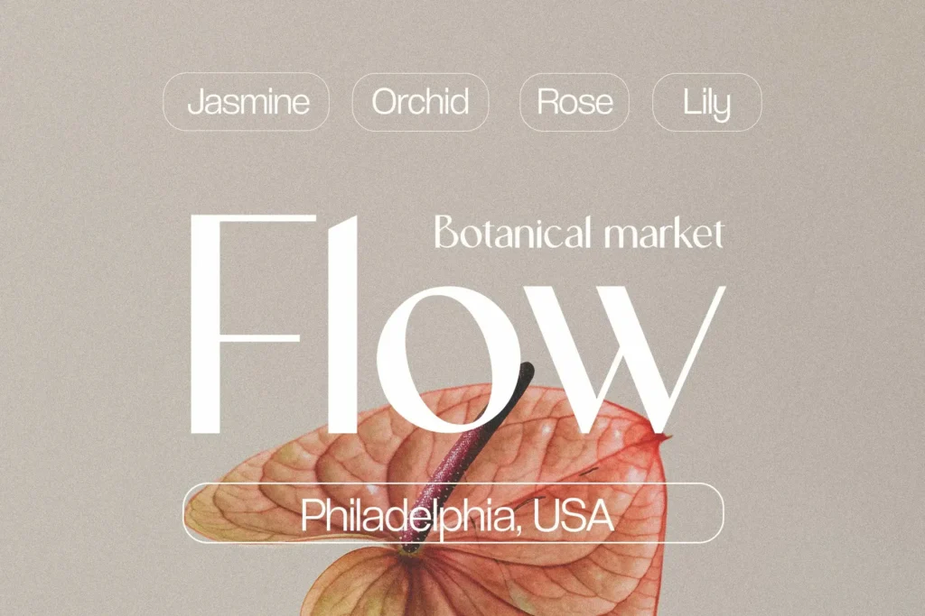
Gencha Font is a clean and contemporary sans serif font designed for versatility in modern creative work. With refined minimalist letterforms, Gencha delivers a sophisticated aesthetic that fits a wide range of design needs from branding and editorial layouts to social media graphics and logo design. Its sleek proportions make text feel professional without distracting from your message, making it a go-to choice for designers who want understated elegance with broad appeal.
2. Hipo Font
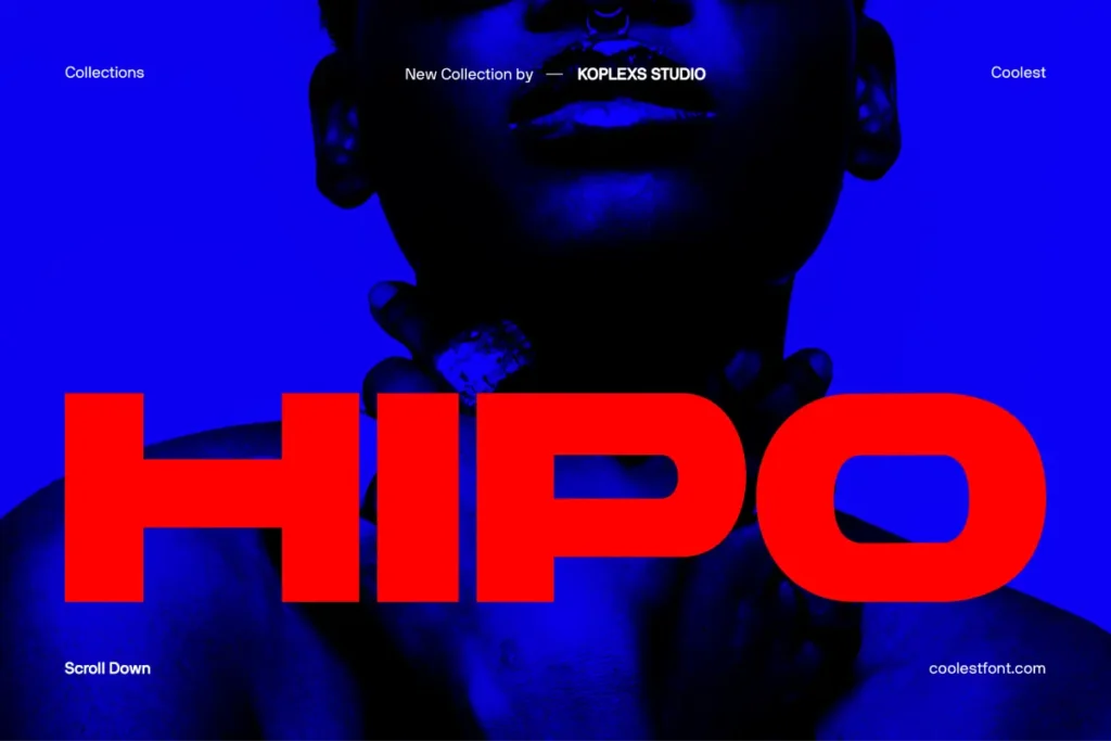
Hipo Font is a bold and modern sans serif typeface that brings strength and clarity to design projects. Built with clean geometric shapes and a striking visual weight, Hipo makes content stand out while still feeling refined and elegant. This font works well for brand identities, headlines, packaging, and digital interfaces where strong visual impact is needed. Its extended character support and balanced forms ensure it performs well across both print and screen designs.
3. Bufs Font
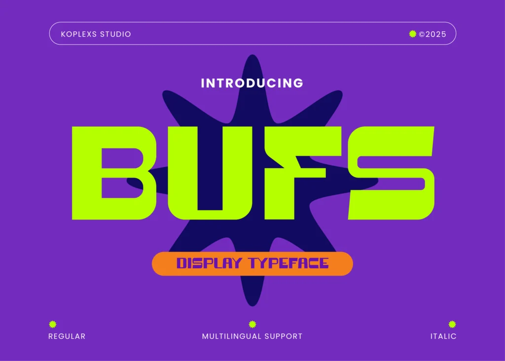
Bufs Font channels a bold futuristic aesthetic within the sans serif category. It stands out with distinctive shapes and forward-leaning energy that suits tech, sports, and modern branding projects. Bufs gives designers the ability to create eye-catching layouts and dynamic headlines that feel fresh and contemporary. Use it when you want to communicate innovation and movement in your visual identity.
4. Barytons Font
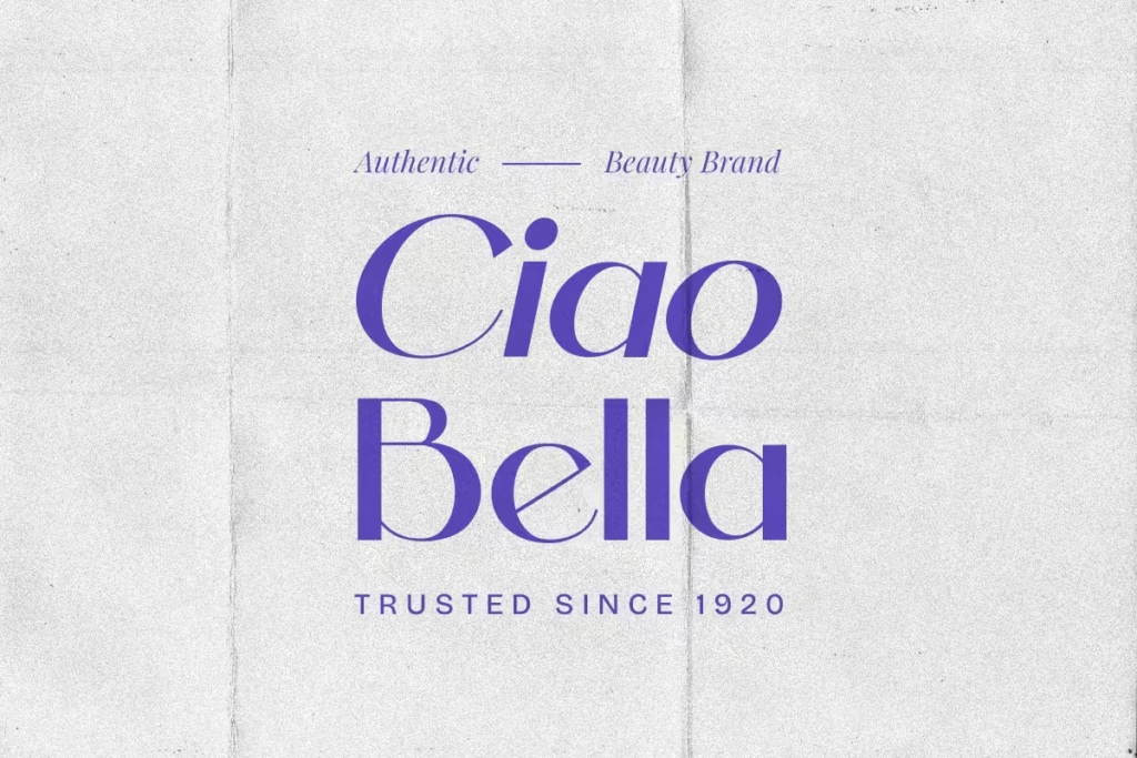
Barytons Font is a versatile sans serif typeface that blends neutral elegance with subtle character. It is designed to work in multipurpose scenarios such as corporate branding, editorial design, and web interfaces. With clean lines and balanced spacing, Barytons maintains clarity and professionalism, making it suitable for long text as well as display use. Its adaptability helps maintain visual coherence across applications.
5. Bourne Font
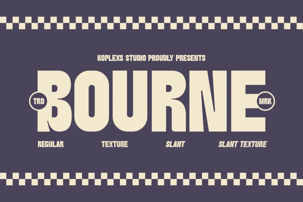
Bourne Font offers a crisp and modern sans serif style with a professional tone. Ideal for branding and identity work, this font achieves a polished look without appearing cold or sterile. Its balanced letterforms provide excellent readability for both headlines and body text, helping brands convey messages with confidence and clarity.
6. Backfarm Font

Backfarm Font brings a unique yet functional approach to sans serif typography. With clean and open characters, Backfarm supports seamless legibility in digital projects and print applications alike. This makes it a practical yet stylish choice for websites, marketing materials, and product packaging where readability is a priority without compromising aesthetic appeal.
7. Hypogea Font
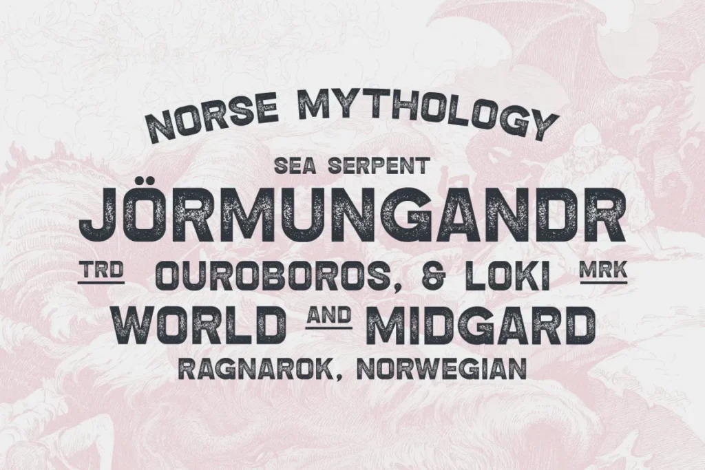
Hypogea Font stands out as a bold sans serif typeface with a vintage modern touch. Its geometric shapes and textured variations make it ideal for projects that need personality without losing contemporary aesthetics. Hypogea works particularly well in brand logos, posters, packaging, and creative layouts where visual punch and stylistic flair are desired.
8. Milek Font
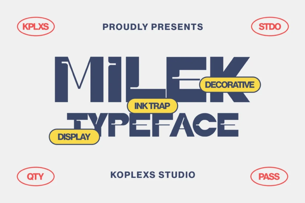
Milek Font is a modern sans serif display font that combines chunky ink trap styling with geometric elegance. This typeface brings bold character with decorative elements that still maintain strong readability, making it excellent for branding, posters, and headlines that require both style and substance. Milek’s unique aesthetic supports visual interest while preserving professional tone.
9. Saloums Font
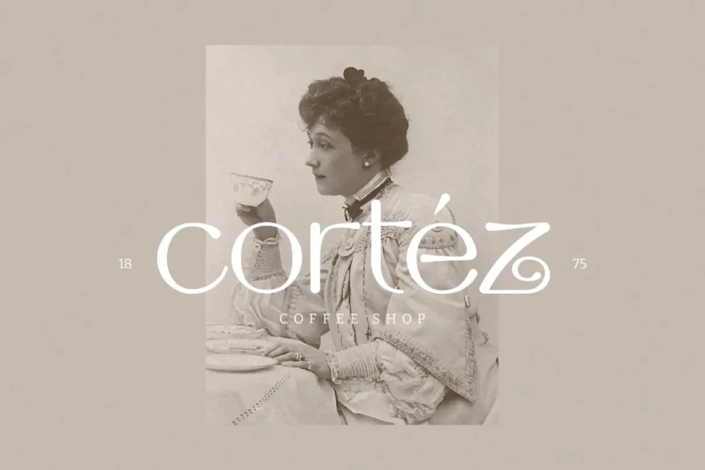
Saloums Font is a sleek and contemporary sans serif typeface with a minimalist and elegant feel. Its clean lines and geometric accuracy give it versatility in modern design work, particularly for fashion, editorial covers, and sophisticated branding projects. Saloums delivers clarity while adding subtle stylistic character for impactful visual presentation.
Each of these best sans serif typeface fonts offers different strengths for modern design and branding. Some like Hipo Font and Hypogea Font emphasize bold visual impact, while others such as Gencha Font and Backfarm Font focus on clean readability and versatile use across media. Fonts like Milek Font bring unique stylistic elements that work well in headline and display contexts. Overall, choosing the right sans serif typeface font depends on your project goals whether you need clarity, elegance, personality, or bold character.
Read More : Find Which Font Easily with Smart Font Identifier Tools
Tools and Resources for Choosing Sans Serif Typeface Fonts
Trusted Font Platforms
If you are selecting a sans serif typeface font, these tools are widely trusted:
- Google Fonts for free and open source fonts
- Adobe Fonts for professional grade typography
- Font pairing tools for hierarchy and contrast
Always test fonts in real layouts before final selection.
Practical Tip From Experience
In my experience working with digital brands, testing typography in live prototypes reveals readability issues that static previews never show.
Typography should always be tested in context.
Conclusion
The dominance of the sans serif typeface font is not a trend. It is a reflection of how people read, interact, and trust information in the digital age.
From UX performance to branding psychology, this font style delivers clarity, accessibility, and credibility.
If you are building digital content, interfaces, or brand identity, typography is not decoration. It is strategy.
Choose your fonts intentionally.
FAQ About Sans Serif Typeface Font
What does sans serif typeface font mean?
It refers to a font style without decorative strokes at the ends of letters, resulting in a clean and modern appearance.
Is sans serif better for websites?
Yes. Sans serif typeface fonts are generally more readable on screens and perform better in digital interfaces.
Are sans serif fonts professional?
Absolutely. Many corporate, tech, and healthcare brands rely on sans serif fonts to convey professionalism and trust.
Can sans serif fonts be used for long text?
Yes. When properly sized and spaced, they are excellent for long form digital content.
Why do modern brands prefer sans serif fonts?
They communicate simplicity, innovation, and digital readiness, which aligns with modern brand values.
