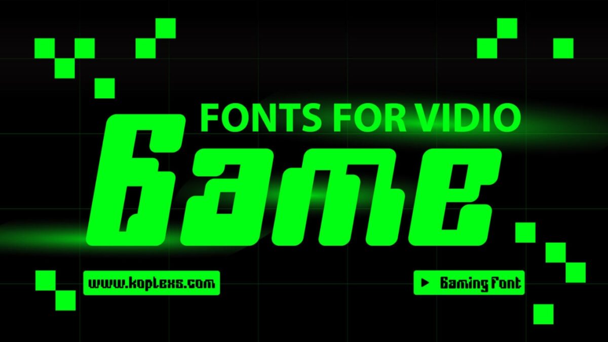
Fonts for video games for Modern, Retro, and Futuristic Designs. Video game typography does more than decorate a title screen. It helps set the mood, guides the player, and makes a game feel recognizable in seconds. Koplexs Studio positions itself as a creative font store focused on modern, aesthetic, and timeless typefaces, and its display-font catalog is built around strong personality and high readability. That makes it a useful place to look for a video game font, especially when you need gaming fonts, gaming letters, or a standout font game feel for titles, menus, HUDs, posters, and logos.
What makes type so important in games is simple: players notice it fast, and they rely on it even faster. Typography research and usability references consistently point to legibility, contrast, spacing, and clear structure as core parts of readable digital text, while game-design research notes that typography helps connect the user to the game and support the interface. In other words, the right font can make a game feel sharper, friendlier, darker, or more futuristic before a single line of dialogue appears.
What makes a font work in video games
A strong game font needs personality without sacrificing clarity. For title screens and key art, bold forms usually work best because they survive compression, scale well, and stay readable on different devices. For menus and in-game UI, the best choice is often a font with clean spacing and a structure that does not collapse on small screens. This is why the same game may use one font for its logo, another for dialogue, and a third for item labels.
Koplexs’ display-font category is especially relevant here because it is explicitly aimed at branding, posters, logos, and headlines, with strong personality and high readability. That makes many of its fonts adaptable for games, even when they were not made only for gaming. The trick is matching the font’s mood to the genre: retro arcade, cyberpunk, fantasy, cozy, horror, or premium story-driven design.
25 Best Fonts for Video Games for Modern, Retro, and Futuristic Designs
1. Robix Game Font
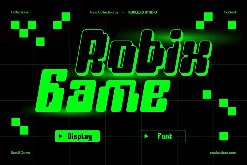
Robix Game Font is one of the clearest gaming-first choices in the Koplexs catalog. It is described as a bold, futuristic display font that blends retro gaming nostalgia with digital precision, and Koplexs says it works for video game titles, RPG and sci-fi projects, gaming logos, UI screens, and splash screens.
2. Bufs Font
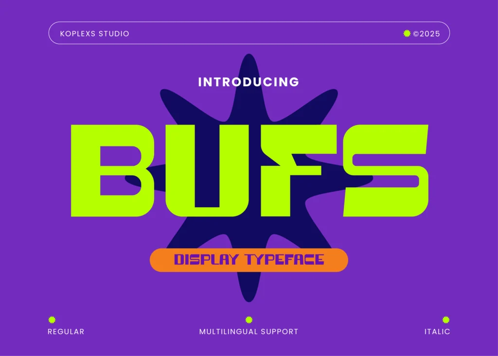
Bufs Font is built for a modern sci-fi mood. Koplexs describes it as a bold futuristic sans serif display font for gaming, logos, tech, and sci-fi designs, which makes it a strong fit for esports branding, launcher screens, and futuristic HUD text.
3. Coret Font
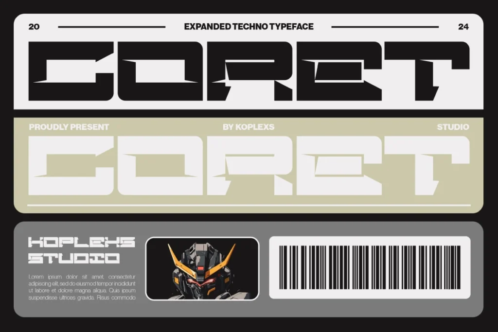
Coret Font is a sharp option for cyber worlds and next-gen interfaces. Koplexs says it is suitable for building a cyber world and developing a next-gen game interface, so it fits especially well in futuristic strategy games, cyberpunk menus, and title overlays.
4. Moxin Font
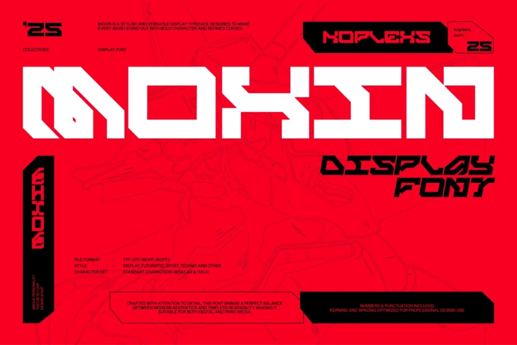
Moxin Font feels like a natural match for sci-fi and cyberpunk projects. Koplexs calls it a futuristic, cyberpunk tech font that is perfect for sci-fi, gaming, and modern design, which makes it ideal for game logos, menu headers, and branded overlays.
5. Hipo Font
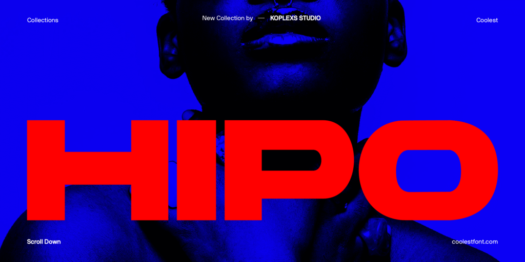
Hipo Font brings a cleaner but still stylish energy. Koplexs describes it as bold, modern, and elegant, with uses across branding, logos, headlines, posters, and packaging, so it can work well for polished game titles, store pages, and premium UI text.
6. KOHEK Font
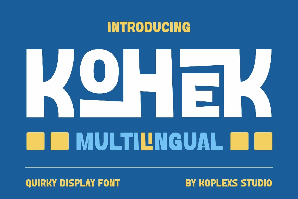
KOHEK Font adds a quirky display personality that suits arcade-inspired branding. Koplexs says it is bold, quirky, and includes ligatures, which gives it enough character for indie game logos, playful menu systems, or stylized achievement screens.
7. Blockier Font
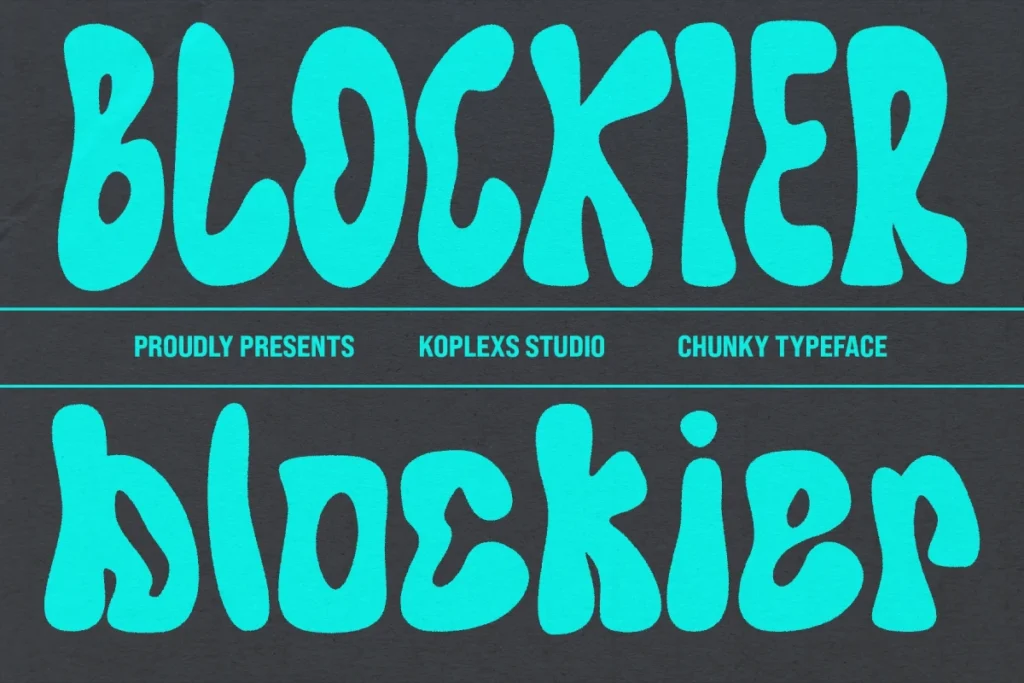
Blockier Font is a playful retro pick with broad appeal. Koplexs describes it as a groovy retro display font for playful and creative designs, which makes it a good fit for pixel-adjacent branding, cozy games, and cheerful arcade visuals.
8. Hoday Font
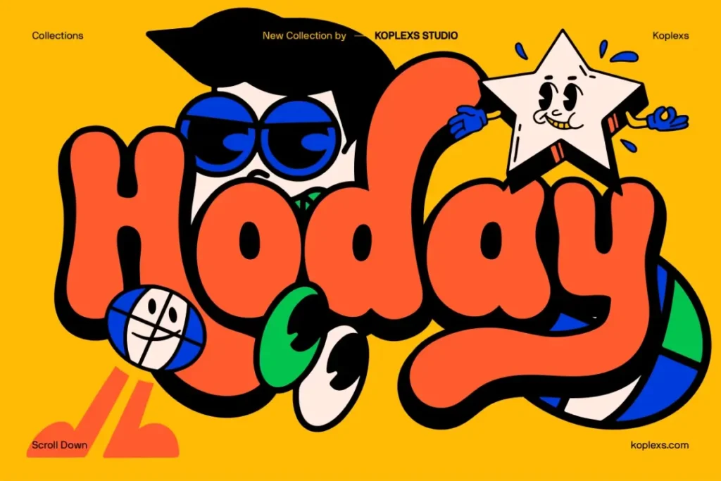
Hoday Font is a bold bubble-style option with a very game-friendly tone. Koplexs presents it as a retro bubble display font, and that chunky personality can work beautifully in arcade menus, fun mobile games, and collectible-style title cards.
9. Hotix Font
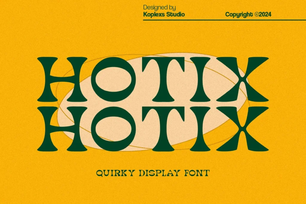
Hotix Font sits between vintage charm and modern energy. Koplexs calls it a bold, quirky display font with vintage aesthetics and a modern twist, which makes it useful for retro action games, neon-themed posters, and stylized cover art.
10. Hypogea Font
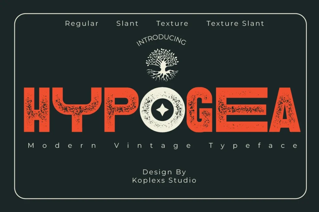
Hypogea Font feels especially strong for bold title systems. Koplexs says it is designed for impact, clarity, and character, with subtle retro details that evoke a timeless look, so it can suit adventure games, cinematic menus, and narrative-driven branding.
11. Drive Ryder Font
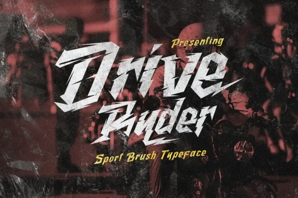
Drive Ryder Font has a name that already suggests motion and speed. It appears in Koplexs’ display-font catalog, which makes it a smart candidate for racing games, sports games, cyber streets, or anything that needs a fast and aggressive title style.
12. Dasko Font
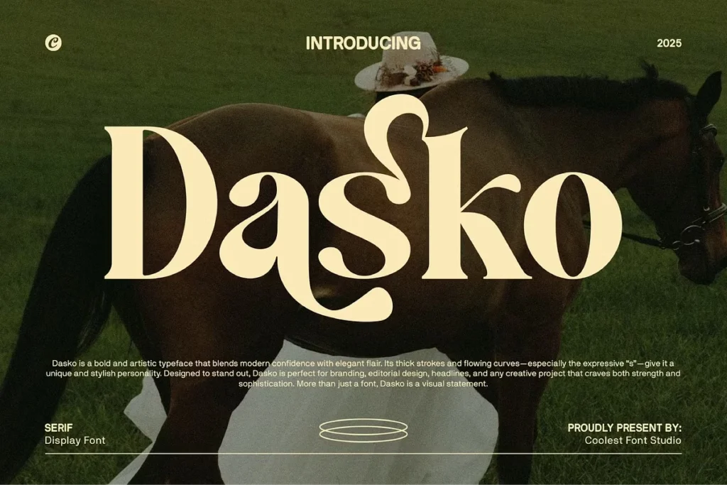
Dasko Font is a refined choice for games that need a premium edge. Koplexs describes it as a modern elegant serif with luxury style, so it can work well for fantasy RPG branding, story-heavy titles, and polished splash screens.
13. Domina Font
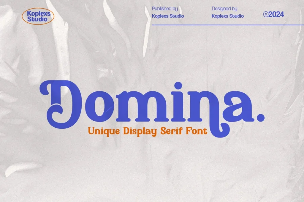
Domina Font belongs in the “strong identity” category. It is listed in Koplexs’ fancy-font selection, and that kind of expressive styling is often useful for game titles that need a dramatic, decorative, or vintage-inspired look.
14. Gantic Font
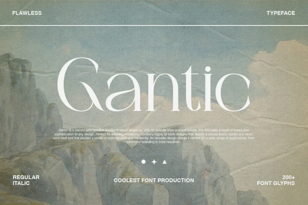
Gantic Font is another display choice that can serve bold game branding well. It appears in the Koplexs display catalog, and fonts from this group are meant to carry strong personality and headline-level visibility, which is exactly what a memorable title screen needs.
15. Garo Font
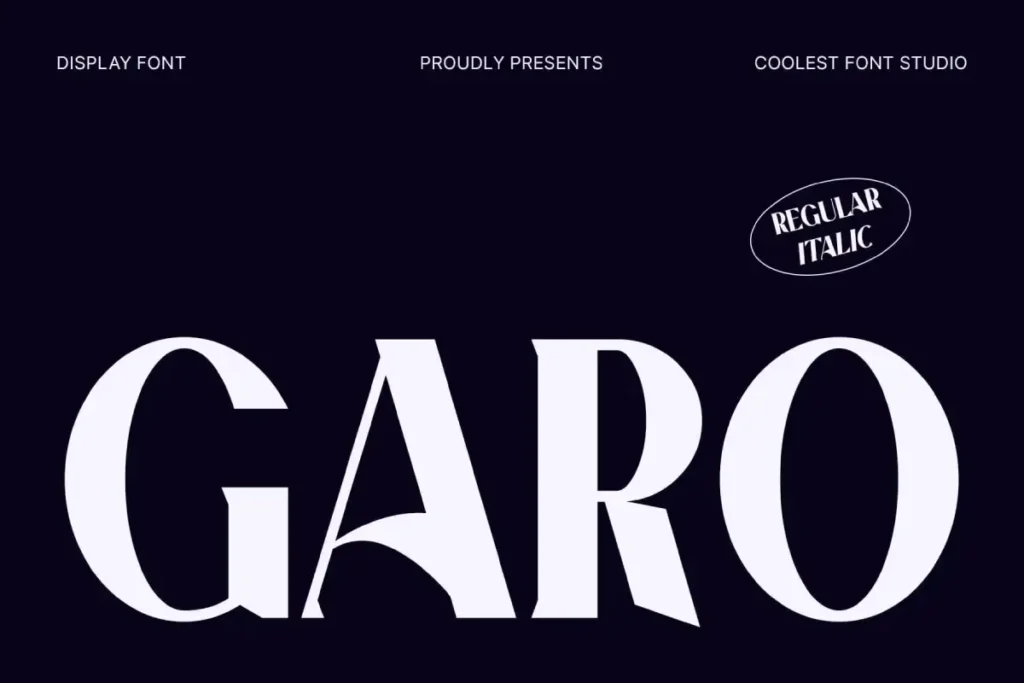
Garo Font blends elegance and artistic structure. Koplexs describes it as a bold, elegant, and artistic display font, and that gives it a good place in fantasy games, premium branding, or story-driven titles that need a dramatic serif look.
16. Grogie Font
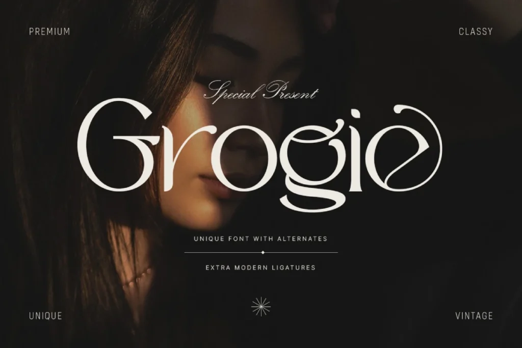
Grogie Font is a flexible display font with a lively identity. It appears in Koplexs’ display catalog, and that alone makes it a strong candidate for indie games that want a distinct but not overly complicated visual voice.
17. Holagen Font
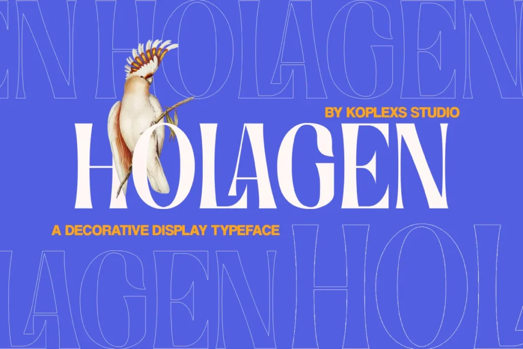
Holagen Font leans decorative and stylish. Koplexs describes it as a decorative serif display font for luxury branding, logos, and posters, but that same refined quality can also suit fantasy, adventure, or magical game worlds.
18. LOST LATE Font
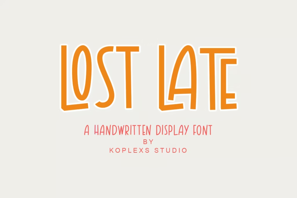
LOST LATE Font has a playful sophistication that can stand out in game branding. Koplexs describes it as a stylish display font combining playful charm and elegant sophistication, which makes it a strong fit for indie titles, visual novels, and elegant arcade branding.
19. Masku Font

Masku Font is one of the more solid all-rounders in the Koplexs set. Koplexs calls it a bold, chunky display font with modern and classic charm, and it can easily support action titles, retro-futuristic logos, or high-impact in-game headlines.
20. Maista Font
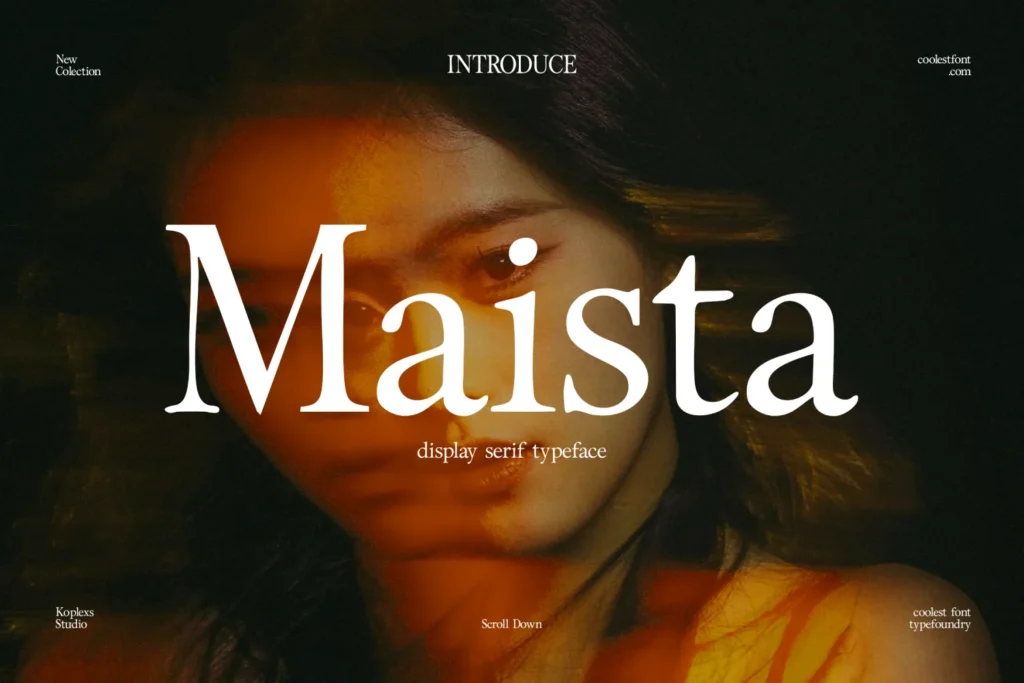
Maista Font is a more elegant path for games that want sophistication. Koplexs describes it as an elegant modern serif font that blends luxury and timeless style, which makes it useful for fantasy worlds, narrative games, and premium menu systems.
21. Milek Font
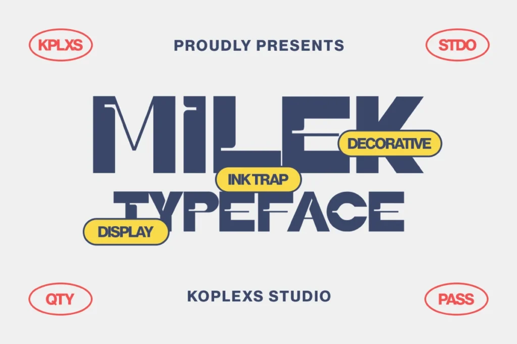
Milek Font is a bold modern display font with a chunky structure and ink-trap detail. Koplexs says it is perfect for branding, logos, posters, covers, and packaging, and that strong geometry can translate well into game UI, esports branding, and bold title art.
22. Wizards Font
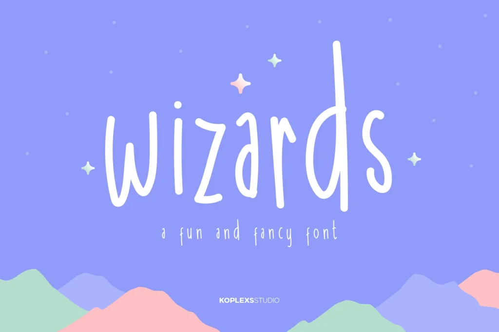
Wizards Font is a very fitting choice for fantasy and magical game branding. Koplexs describes it as playful, cute, and fancy, which gives it enough charm for spell-themed menus, whimsical adventure games, and imaginative title graphics.
23. Westag Font
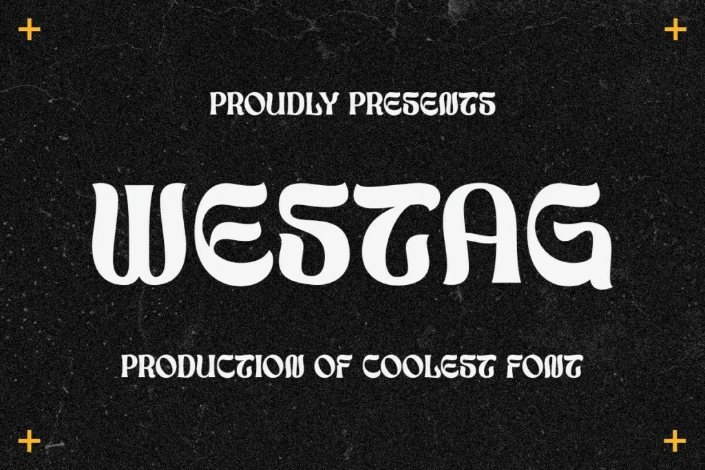
Westag Font appears in the final page of Koplexs’ display-font catalog, which keeps it in the same strong headline territory as the other picks. Because it sits in that display category, it can be considered for game logos and bold UI accents where personality matters.
24. Charquid Font
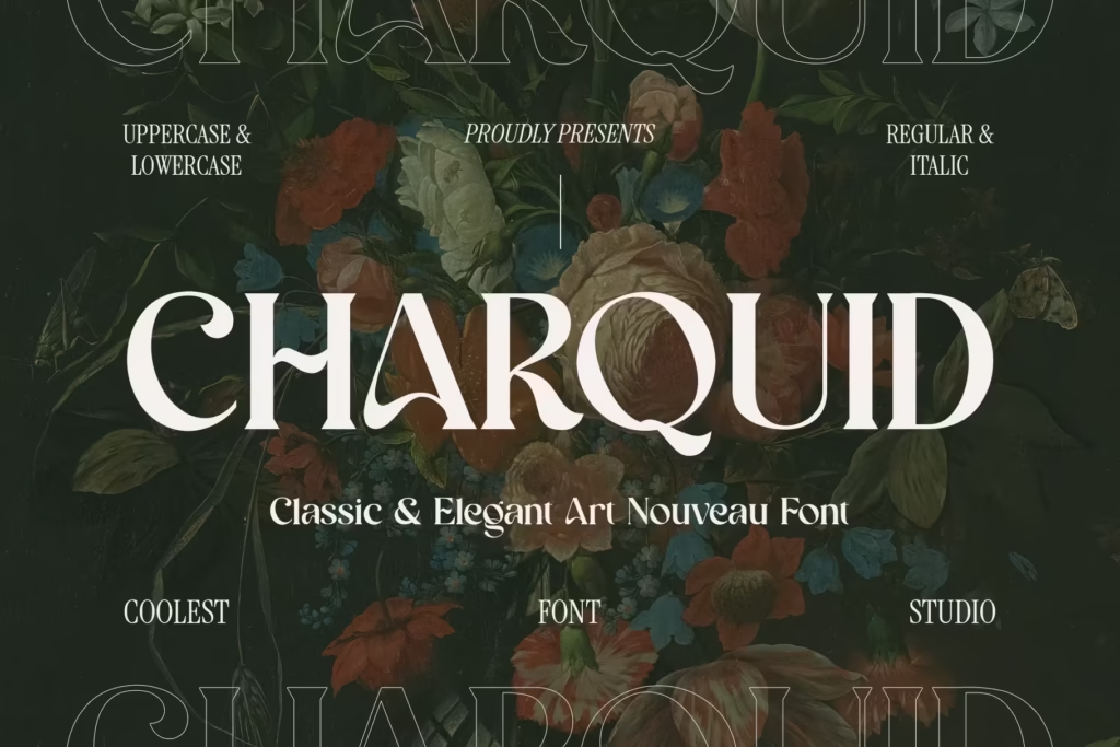
Charquid Font offers a more elegant route for story-rich games. Koplexs describes it as an Art Nouveau serif font, which makes it especially attractive for fantasy, historical, and luxury-inspired game visuals rather than pure arcade styling.
25. Amoveno Font
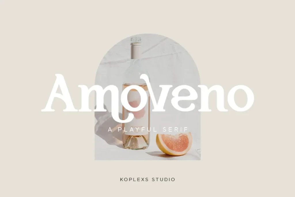
Amoveno Font is a smart wildcard pick for cozy, whimsical, or fantasy-driven games. Koplexs describes it as a modern, playful serif font with elegance and sophistication, so it can bridge the gap between friendly character and premium polish.
How to choose the right game font for your project
Fonts for Video Games. The best choice depends on genre and platform. Retro arcade and pixel-inspired games usually benefit from blocky, bold, or nostalgic forms, while cyberpunk and sci-fi projects often look stronger with futuristic sans serifs. Fantasy and story-driven games can use more decorative serif styles, especially when the title screen needs drama or atmosphere. For menus and UI, the safest option is usually the cleanest one because readability matters more than decoration once the player starts interacting.
A good workflow is to pair one expressive headline font with one highly readable interface font. That balance keeps the brand memorable without making the game hard to use. It also helps the typography feel intentional instead of crowded, which matters a lot in modern gaming screens where text competes with animation, effects, and small device sizes.
Why these Koplexs fonts stand out
Koplexs’ catalog works well for gaming because it does not lock you into one look. The site includes bold sans serifs, quirky display fonts, retro pieces, elegant serifs, and playful styles, so it covers multiple game moods instead of only one aesthetic lane. That range matters for developers, streamers, indie teams, and designers who need typography that can move between logos, covers, menus, and promo art.
It also helps that many of these fonts are already sold and categorized with uses like logos, headlines, posters, branding, and modern design work. That is a strong signal that they are meant to be seen, not hidden, which is exactly what good game typography should do.
Conclusion
Choosing the right fonts for video games is not just a visual decision. It shapes identity, supports usability, and sets the emotional tone before the player even presses start. From Robix Game Font and Bufs Font for futuristic worlds to Wizards Font and Amoveno Font for fantasy or cozy projects, Koplexs offers a wide set of options that can fit many genres and branding needs. If your goal is to make a title screen, UI, logo, or promo asset feel more memorable, the right video game font can do a lot of heavy lifting.
FAQ
What is the best font style for video games?
Bold display fonts and clean sans serifs usually work best because they stay readable while still feeling expressive. For fantasy and narrative games, serif styles can also work very well when you want a more dramatic tone.
Are retro fonts good for game titles?
Yes. Retro fonts are especially effective for arcade, pixel, and nostalgia-driven projects because they instantly signal a familiar gaming mood. Koplexs has several options that lean into that feeling, including Robix Game Font, Blockier Font, and Hoday Font.
Which Koplexs fonts fit sci-fi or cyberpunk games?
Robix Game Font, Bufs Font, Coret Font, and Moxin Font are the strongest sci-fi-leaning picks in this list. They are described by Koplexs with futuristic, cyber, digital, and gaming-focused language that fits high-tech worlds well.
Can serif fonts work in video games?
Yes, especially in fantasy, adventure, historical, or story-heavy games. Serif fonts like Dasko, Garo, Maista, Charquid, and Holagen can make a game feel more premium, dramatic, or world-driven.
How do I keep game text readable?
Use clear spacing, strong contrast, and a font that matches the size and device where it will appear. Research on digital typography consistently shows that readability improves when the typeface is clean, the spacing is balanced, and the text is designed for the screen it will live on.