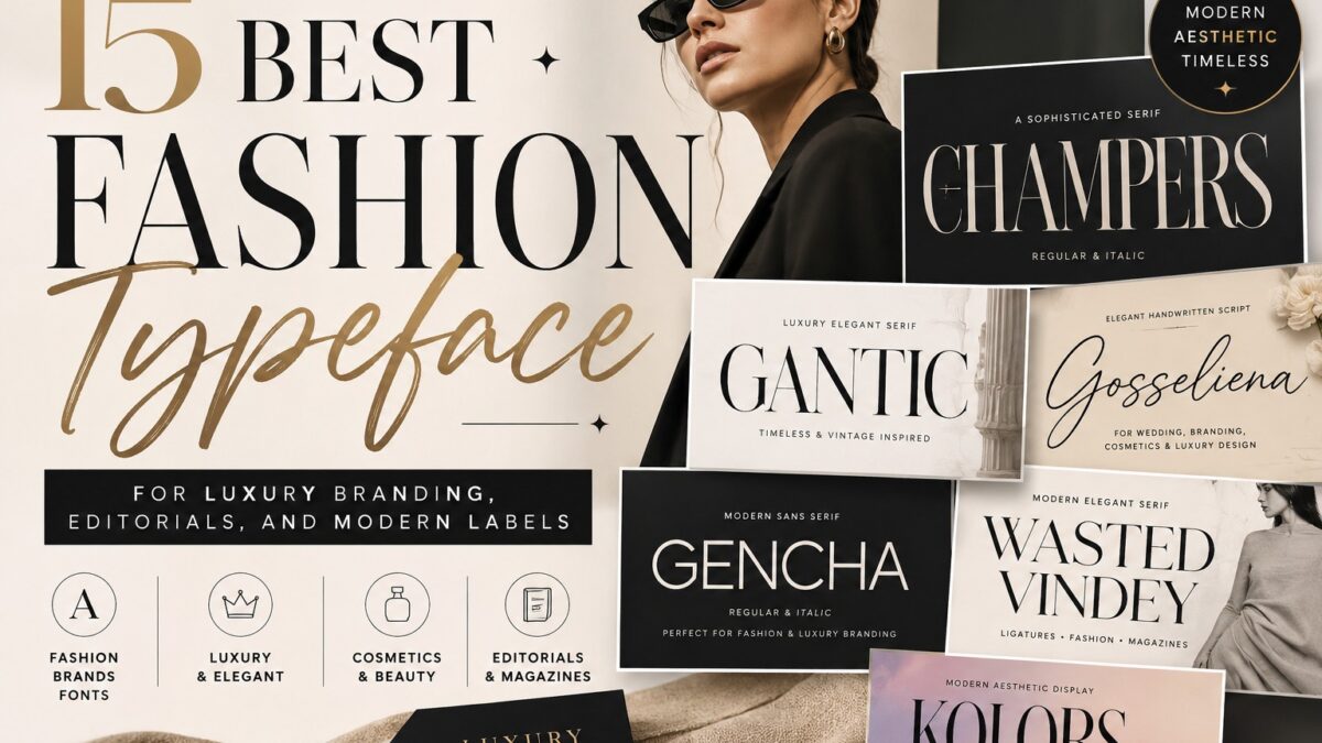
Fashion Typeface. The right fashion typeface depends on the job. Choose a high-contrast serif for editorial drama, a clean sans serif for contemporary systems, a display face for campaign impact, or a script for short signature accents. Test it on a real logo, label, website, and package before selecting the correct commercial license.
Choosing a fashion typeface is not simply a search for the most elegant specimen. A wordmark that looks impressive on a campaign poster may lose clarity on a woven label, a mobile navigation bar, or a small cosmetics package. The strongest choice is the one that expresses the brand while surviving every place the brand must appear.
This guide compares 15 typefaces from the Koplexs Studio catalog by visual character, intended use, available styles, published file formats, and practical limitations. It is designed for brand owners and designers who need a useful shortlist, not just another gallery of attractive fonts.
Commercial disclosure: Every typeface in this guide is sold by Koplexs Studio. The recommendations are limited to the Koplexs catalog and should not be interpreted as an independent ranking of every fashion font on the market.
What Is a Fashion Typeface?
A fashion typeface is a type design selected to communicate the identity of a fashion, beauty, accessories, or editorial brand. It is not a formal technical category. The term usually describes how a typeface performs in a wordmark, campaign headline, lookbook, garment label, packaging system, website, or social asset.
In professional terminology, a typeface is the overall design family, while a font is a specific style or implementation within that family. Adobe provides a useful overview of the distinction in its guide to font types and typefaces.
How We Evaluated These Typefaces
This editorial review uses information published on the Koplexs product and license pages. Each recommendation was assessed against five practical questions:
- Brand fit: What mood and market position does the letterform communicate?
- Application range: Is it best for logos, headlines, labels, packaging, websites, or short accents?
- Family range: Does the published product include Regular, Italic, Oblique, alternates, or ligatures?
- Production risk: Could thin strokes, decorative alternates, or connected scripts lose clarity at small sizes?
- Licensing: Which usage rights must be confirmed before the font is used commercially?
The product pages commonly list OTF, TTF, WOFF, and WOFF2 files and describe multilingual glyph support. Because the exact language list and total glyph counts were not consistently visible, global brands should confirm the required characters on the product page or with Koplexs before purchase.
Read More : Best Fonts for Thumbnails
Quick Comparison: 15 Fashion Typeface Picks
| Typeface | Category | Best for | Published styles | Watch-out |
| Champers | High-contrast serif | Luxury wordmarks, perfume, covers | Regular + Italic | Test thin strokes at label size |
| Gantic | Editorial serif | Boutiques, jewelry, campaigns | Regular + Italic | Avoid long body copy |
| Holagen | Decorative display serif | Posters, launches, cosmetics | Single display style | Use alternates selectively |
| Wasted Vindey | Modern serif | Editorials, packaging, logos | Regular + Italic | Check decorative details in print |
| Reilova | Vintage-modern serif | Beauty, boutique, romantic labels | Single display style | Needs a text companion |
| Anorthic | Modern luxury serif | Skincare, clean editorials | Regular + Italic | Confirm small-size contrast |
| Cosity | Bold modern serif | Headlines, packaging, campaigns | Regular + Italic | May dominate restrained systems |
| Gencha | Modern sans serif | Contemporary logos, digital work | Regular + Italic | Pair with a robust UI family |
| Barytons | Refined sans serif | Minimal labels, web headers | Regular + Italic | Limited weight range |
| Kolors | Expressive display | Street-led campaigns, posters | Regular + Oblique | Not intended for body text |
| Gosseliena | Handwritten script | Beauty, jewelry, signatures | Single script style | Keep copy short |
| Lovaria | Calligraphic script | Boutiques, bridal, packaging | Single script style | Confirm all required features |
| Vilmada | Signature script | Beauty marks, campaign accents | Single script style | Test connected letters |
| Angelica Signature | Calligraphic signature | Personal brands, cosmetics | Single script style | Thin strokes need production tests |
| Welcome Dream | Friendly script | Lifestyle, bridal, boutiques | Single script style | Avoid small or dense text |
Choose by Brand Direction
If you need a fast shortlist, start with the visual direction rather than the popularity of a font:
- Luxury and editorial: Champers, Gantic, Anorthic, or Wasted Vindey.
- Modern and minimal: Gencha or Barytons.
- Expressive campaigns: Holagen, Cosity, or Kolors.
- Romantic or vintage: Reilova, Gosseliena, Lovaria, or Welcome Dream.
- Signature-led beauty or personal branding: Vilmada or Angelica Signature.
Browse the complete serif font collection, script font collection, sans serif collection, or display font collection.
Read More : Serif Display Fonts
15 Best Fashion Typefaces for Creating a Luxury Brand Identity
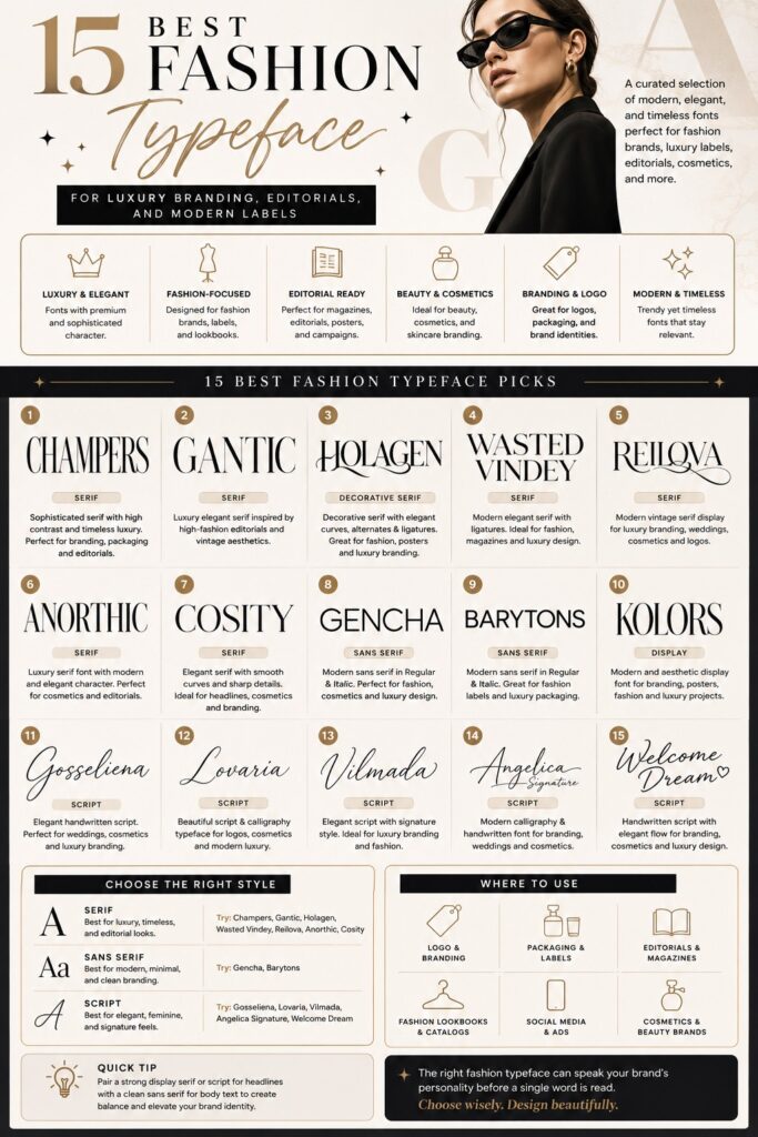
Creating a luxury brand identity starts with choosing the right typography. The perfect fashion typeface can instantly communicate elegance, exclusivity, and professionalism before customers even read a single word. To help narrow down your options, we’ve selected the best fashion typefaces that combine timeless style, modern sophistication, and strong branding potential. The author especially recommends the typefaces below because they offer a wide variety of styles, making it easier to find the perfect match for different fashion brands, luxury labels, beauty businesses, and editorial projects.
1) Champers Font
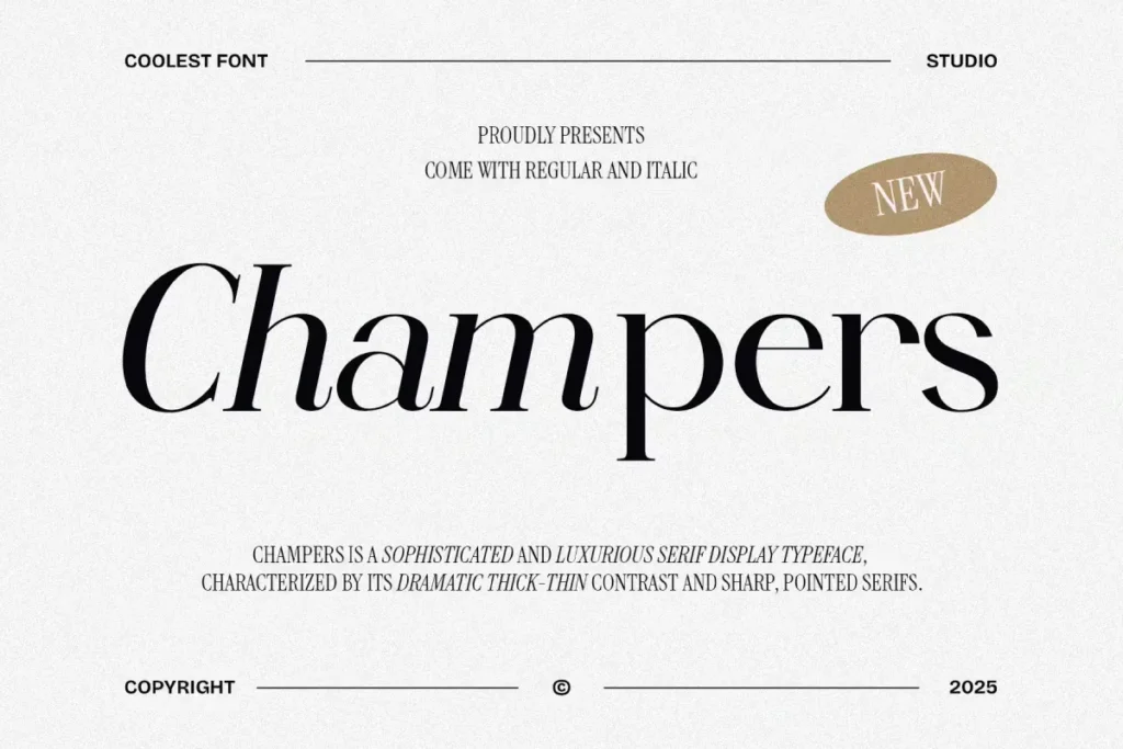
Champers Font Best for: Luxury wordmarks, fragrance and cosmetics packaging, magazine covers, and premium campaign headlines.
Why it works: Champers uses pronounced thick-to-thin contrast and pointed serif details to create a polished editorial voice. The published Regular and Italic styles give designers enough contrast for a simple headline system without changing families.
Watch-out: High-contrast hairlines can disappear in embroidery, foil stamping, low-resolution printing, or small mobile text. Use Champers as a display or identity face and pair it with a more robust text family for product descriptions and interface copy.
Published features: Published features include Regular and Italic styles, alternates, ligatures, OTF/TTF desktop files, and WOFF/WOFF2 web files.
2) Gantic Font
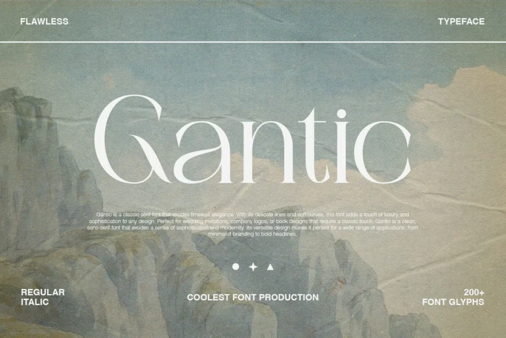
Gantic Font Best for: Boutique fashion, jewelry, beauty packaging, cinematic campaigns, and editorial mastheads.
Why it works: Gantic combines a high-fashion serif structure with softer curves and a more romantic italic. It suits brands that want editorial authority without the colder feel of a strictly geometric wordmark.
Watch-out: The delicate contrast is strongest at display sizes. Long product copy or tightly packed labels may reduce clarity, so test the thinnest strokes on the actual material and production process.
Published features: The product page lists Regular and Italic styles, alternates, ligatures, and OTF, TTF, WOFF, and WOFF2 formats.
Read More : Find Which Font
3) Holagen Font
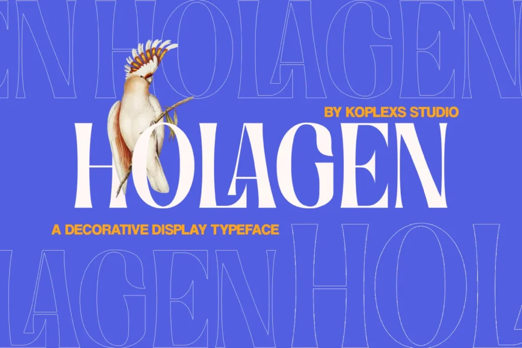
Holagen Font Best for: Campaign posters, product launches, fashion covers, cosmetics, and statement packaging.
Why it works: Holagen is more decorative than a neutral serif. Curves, alternates, and ligatures give art directors room to build a distinctive headline or customized-looking wordmark.
Watch-out: Distinctive alternates can make a logo memorable, but using too many at once can weaken recognition. Choose a consistent character set and document it in the brand guidelines.
Published features: The published package lists a display style with alternates, ligatures, desktop formats, and webfont formats.
4) Wasted Vindey Font
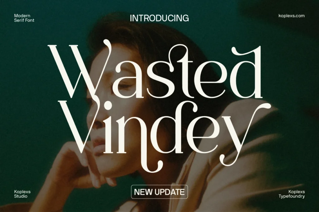
Wasted Vindey Font Best for: Fashion editorials, boutique identity, beauty packaging, poster titles, and magazine-inspired campaigns.
Why it works: Wasted Vindey balances a recognizable serif structure with decorative details. Regular and Italic styles make it easier to create hierarchy between a main title and a supporting accent.
Watch-out: Its fashion-led personality is less suitable for dense e-commerce body copy. Inspect ligatures and alternate characters carefully, especially when they appear in a trademark or product name.
Published features: The product page lists Regular and Italic, alternates, multilingual glyphs, and OTF, TTF, WOFF, and WOFF2 files.
5) Reilova Font
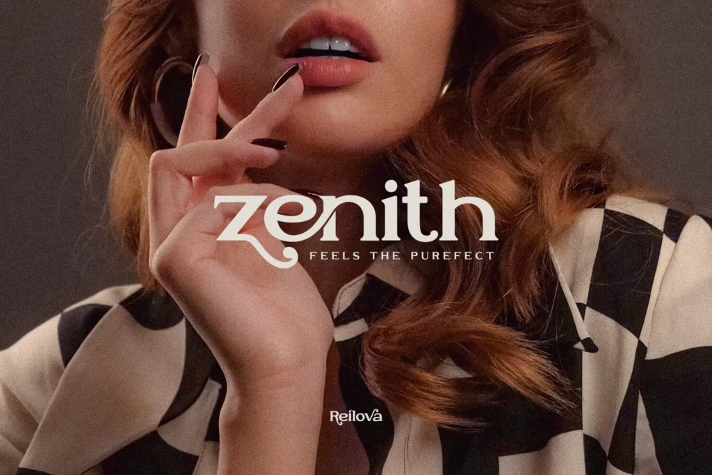
Reilova Font Best for: Romantic fashion labels, skincare and fragrance packaging, wedding-adjacent fashion, and lifestyle campaigns.
Why it works: Reilova combines a vintage serif influence with contemporary curves, alternates, and ligatures. It is useful when the brand needs warmth and heritage without looking strictly historical.
Watch-out: Because it is presented as a display face rather than a broad family, plan a second typeface for size-intensive jobs such as product details, care instructions, menus, or web UI.Published features: Published formats include OTF, TTF, WOFF, and WOFF2, with alternates and ligatures.
6) Anorthic Font
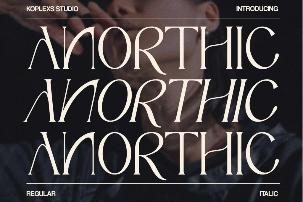
Anorthic Font Best for: Clean luxury branding, skincare, modern editorials, packaging, and restrained campaign typography.
Why it works: Anorthic is a useful middle ground between ornate display typography and an anonymous text serif. Its Regular and Italic styles can support a compact luxury identity system.
Watch-out: Do not assume that “modern” automatically means readable at every size. Test the counters, thin joins, and punctuation on the smallest label and screen size in the system.
Published features: The product page lists Regular and Italic, alternates, ligatures, multilingual glyphs, and desktop/web formats.
Read More : Typewriter Font Tattoo
7) Cosity Font
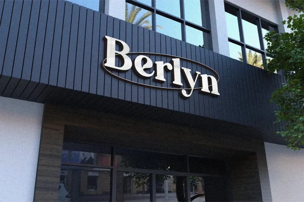
Cosity Font Best for: Bold packaging, magazine headlines, cosmetics, launch graphics, and fashion campaigns that need a stronger voice.
Why it works: Cosity has more visual weight than the most delicate serifs in this list. That can help a headline remain visible over photography or on packaging viewed from a distance.
Watch-out: A forceful display serif can dominate a quiet brand system. Compare it against product photography and the supporting sans serif before committing to it as the main wordmark.
Published features: Published features include Regular and Italic, alternates, ligatures, and OTF, TTF, WOFF, and WOFF2 files.
8) Gencha Font
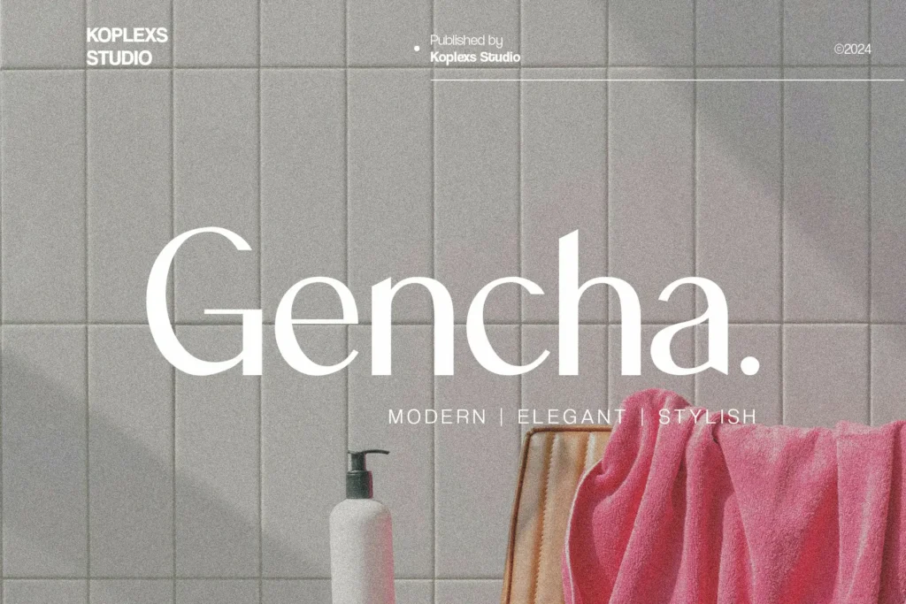
Gencha Font Best for: Contemporary fashion labels, minimal beauty brands, digital campaigns, website headers, and clean wordmarks.
Why it works: Gencha offers a more restrained alternative to the high-contrast serifs. Its clean sans serif structure suits brands that want modernity, clarity, and quieter premium positioning.
Watch-out: Regular and Italic alone may not cover every e-commerce hierarchy. Pair it with a family that offers additional weights if the website needs dense navigation, product data, and accessibility states.
Published features: The published package includes Regular and Italic, alternates, ligatures, multilingual glyphs, and desktop/web formats.
9) Barytons Font
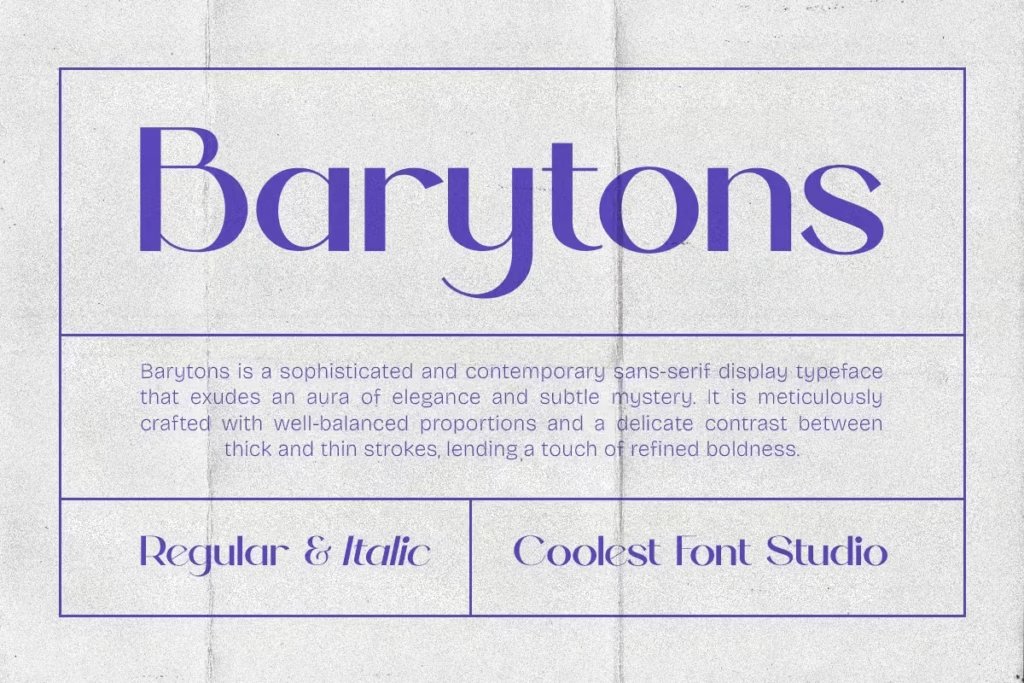
Barytons Font Best for: Minimal labels, modern packaging, refined website headers, stationery, and contemporary brand systems.
Why it works: Barytons keeps the emphasis on proportion and restraint rather than decorative detail. It works when photography and product design should remain the primary visual focus.
Watch-out: Like Gencha, its published two-style range may require a supporting UI family. Check spacing in uppercase wordmarks and verify that the italic has a clear purpose in the system.Published features: The product page lists Regular and Italic, alternates, ligatures, multilingual glyphs, and OTF, TTF, WOFF, and WOFF2 formats.
10) Kolors Font
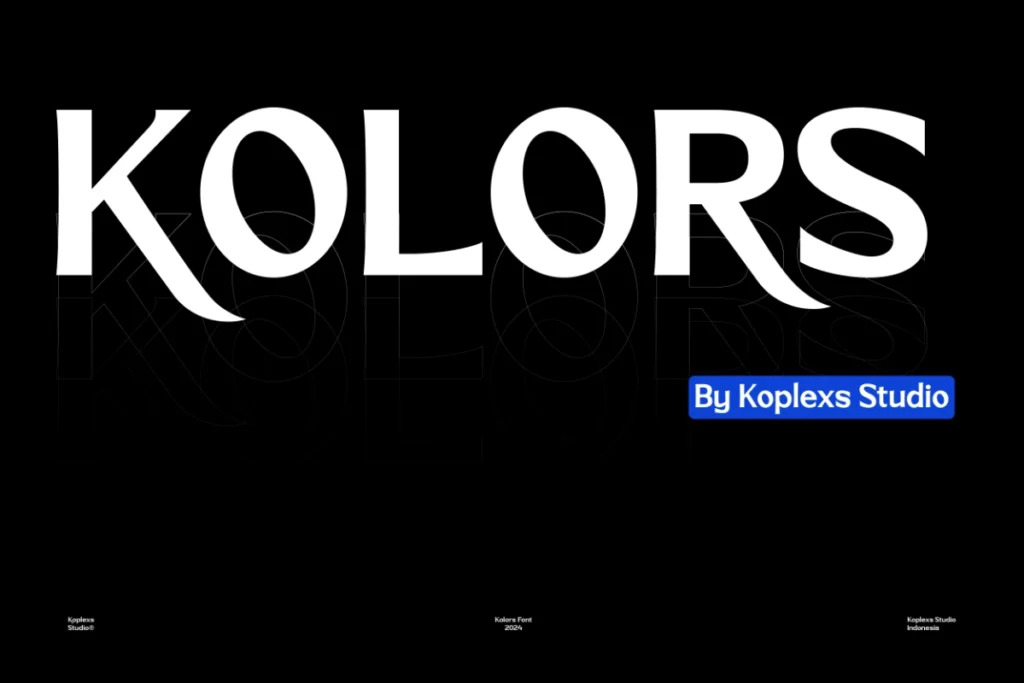
Kolors Font Best for: Expressive fashion campaigns, street-led launches, posters, social graphics, and experimental editorial headlines.
Why it works: Kolors combines geometric structure with organic curves, giving it more movement than a neutral sans serif. It is an option for brands that need energy rather than classic luxury restraint.
Watch-out: Treat it as a display tool. Long paragraphs, care labels, and interface text need a calmer companion face. Test unusual characters in the actual brand name before licensing.
Published features: The published package lists Regular and Oblique, alternates, multilingual glyphs, and OTF, TTF, WOFF, and WOFF2 files.
Read More : Script Alphabet Fonts
11) Gosseliena Font
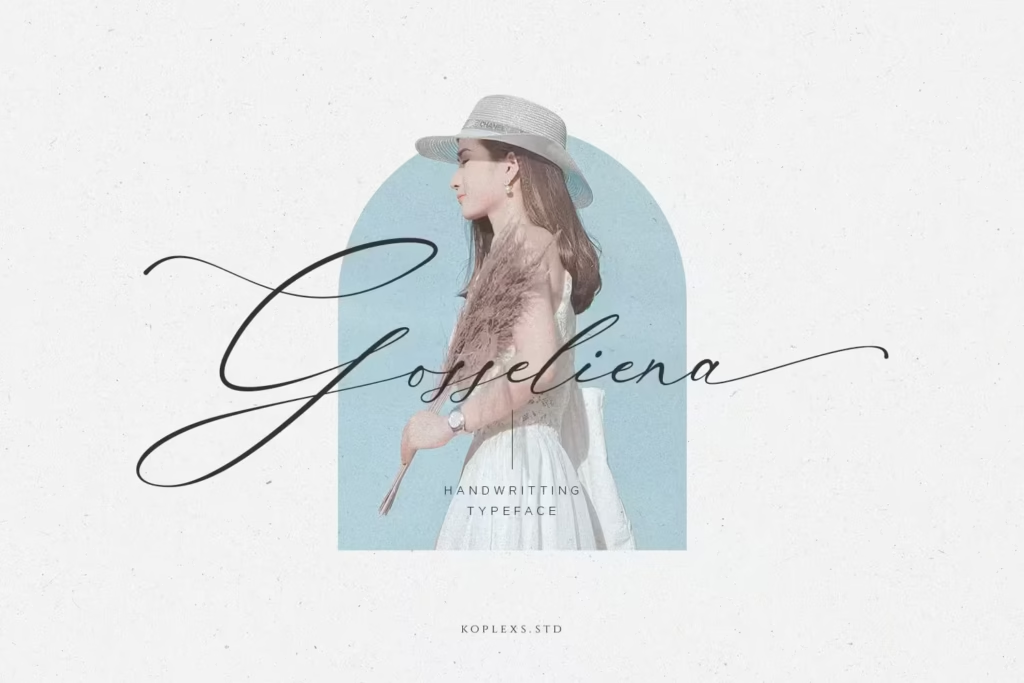
Gosseliena Font Best for: Beauty brands, jewelry, boutique signatures, bridal fashion, packaging accents, and short campaign phrases.
Why it works: Gosseliena adds a handwritten, calligraphic voice that can make a brand feel personal and crafted. Alternates and ligatures provide options for refining a short signature lockup.
Watch-out: Scripts should not carry body copy or critical product information. Confirm that every pair of connected letters in the brand name remains clear, especially at small sizes.
Published features: The product page lists alternates, ligatures, multilingual glyphs, desktop files, and WOFF/WOFF2 web files.
12) Lovaria Font
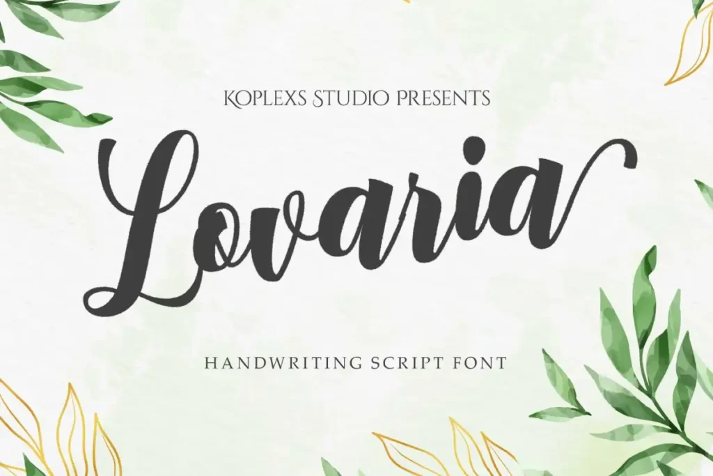
Lovaria Font Best for: Boutique identity, bridal and occasionwear, cosmetics, invitation-led campaigns, and premium packaging accents.
Why it works: Lovaria is a calligraphic script with a romantic and polished direction. It is most useful as a distinctive accent rather than the only typeface in a full fashion communication system.
Watch-out: Confirm the current product page for exact styles, alternates, ligatures, file formats, and required characters before purchase. Test capital letters carefully because they often carry the strongest flourishes in a script logo.
Published features: Use the live product page as the source of truth for the current package and license options.
13) Vilmada Font
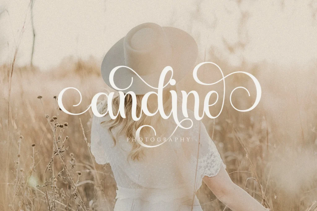
Vilmada Font Best for: Signature logos, beauty packaging, fashion campaign accents, lifestyle labels, and personal-brand collaborations.
Why it works: Vilmada uses flowing strokes, swashes, alternates, and ligatures to create a personal signature effect. It can soften a rigid layout or add contrast to a neutral supporting sans serif.
Watch-out: Connected scripts can create ambiguous letter combinations. Test the full brand name, not only individual glyphs, and avoid reducing the wordmark until thin joins disappear.
Published features: Published features include alternates, ligatures, multilingual glyphs, OTF/TTF files, and WOFF/WOFF2 web formats.
14) Angelica Signature Font
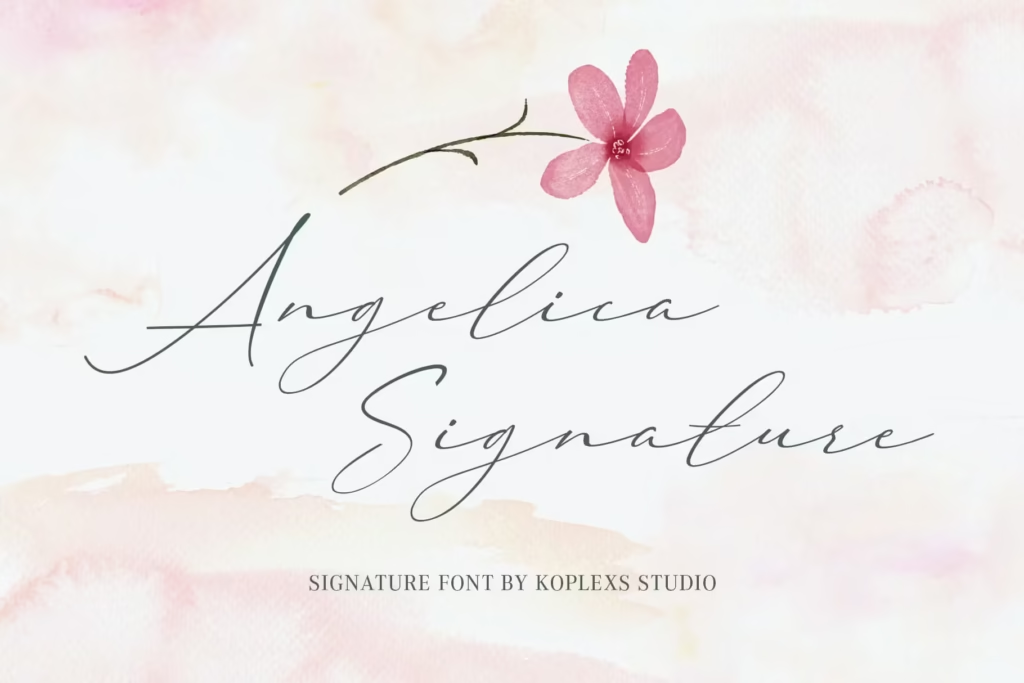
Angelica Signature Font Best for: Personal fashion brands, cosmetics, boutique accessories, creator collaborations, and signature-style accents.
Why it works: Angelica Signature combines modern calligraphy with a handwritten rhythm. It is well suited to identity systems that want an identifiable human mark beside cleaner supporting typography.
Watch-out: Thin strokes and long swashes need testing in embossing, foil, embroidery, and small digital avatars. Simplify the final logo lockup if decorative details compete with recognition.
Published features: The product page lists alternates, ligatures, multilingual glyphs, desktop formats, and WOFF/WOFF2 web files.
15) Welcome Dream Font
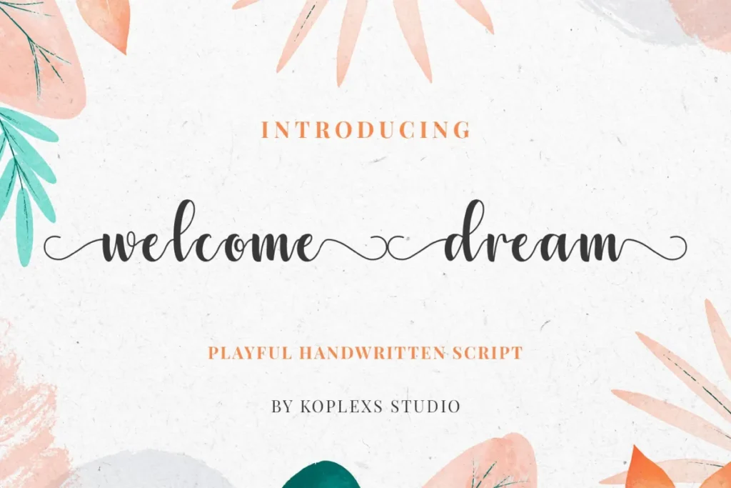
Welcome Dream Font Best for: Lifestyle fashion, bridal, friendly boutiques, beauty packaging, merchandise accents, and approachable campaign typography.
Why it works: Welcome Dream has a softer and more welcoming character than the sharper editorial serifs. It can make an identity feel personal without relying on a literal handwritten signature.
Watch-out: Reserve it for short text. Dense product descriptions, care labels, navigation, and legal copy require a simpler companion face with predictable spacing.
Published features: The published package lists alternates, multilingual glyphs, OTF/TTF desktop files, and WOFF/WOFF2 web files.
Read More : Sans Serif Typeface Font
How to Pair a Fashion Typeface
A brand rarely needs one typeface to do everything. A practical system usually separates the expressive job from the information job:
| Primary face | Recommended role in the system |
| Champers or Gantic | Use for the wordmark and campaign headlines; pair with a neutral sans serif for product descriptions and e-commerce UI. |
| Gencha or Barytons | Use for a clean identity and large headings; pair with a highly legible text family if more weights or compact UI styles are required. |
| Kolors or Holagen | Use for launches and display moments; keep supporting type quiet so the campaign retains hierarchy. |
| Gosseliena, Vilmada, or Angelica Signature | Use for a logo or short accent; pair with a simple serif or sans serif for every longer message. |
For more examples, explore Koplexs guides to serif display fonts and sans serif typefaces.
Read More : Fonts for Tattoo
Test the Typeface Before You License It
A specimen image is only the first filter. Create one test board using the actual brand name and the smallest production conditions you expect to use:
Wordmark: Test uppercase, lowercase, and title case. Review spacing between every pair of letters.
Woven label or care tag: Print or prototype at the intended physical size. Check counters, joins, punctuation, and thin strokes.
Packaging: Test on light, dark, photographic, foil, embossed, and low-contrast surfaces relevant to the brand.
Mobile storefront: Review the logo, navigation, product title, price, and button labels on a small screen.
Campaign headline: Test short and long lines over representative photography.
Global character set: Enter every accented name, currency symbol, punctuation mark, and language-specific character the brand needs.
For accessible digital text, typography also depends on contrast and scale. WCAG 2.2 calls for a contrast ratio of at least 4.5:1 for normal text and 3:1 for large text, subject to its defined exceptions. Decorative campaign typography should never replace essential product information.
Reference: W3C guidance on minimum text contrast.
Read More : Font for Scripts
Font Licensing for Fashion Brands
Important: Visual suitability is not the same as legal permission. Check the current Koplexs license before using a font in a logo, registered trademark, website, social campaign, publication, app, or product for sale.
| License tier | Typical fit | Key check |
| Personal Use | Testing and non-commercial personal work | No business branding or commercial logo use |
| Desktop / Standard | Commercial static work, packaging, merchandise, non-trademark logo | No registered trademark, web embedding, or publishing under this tier |
| Webfont | Embedding on one website via @font-face | Website use only; current terms state a three-year duration |
| Social Media Creator | One small-business brand across social media; includes webfont rights | Check team-size and business-size limits |
| Trademarked Logo | One trademarked brand or product logo | Confirm other platforms and number of brands |
| Extended | Broader commercial, web, social, and trademark use for one brand | Current terms limit this tier to small and medium businesses |
| Corporate | Organization-wide use with broader project and user coverage | Confirm the precise brand and sub-brand scope before purchase |
Read the complete and current Koplexs license terms before purchasing. If the use case crosses several categories, contact Koplexs Studio for written clarification.
Final Recommendation
Do not choose a fashion typeface from one attractive screenshot. Shortlist three options, enter the real brand name, test each one across the smallest and most demanding touchpoints, and compare the license required for the complete brand system.
For an editorial luxury direction, begin with Champers or Gantic. For a cleaner contemporary label, compare Gencha and Barytons. For a more expressive campaign voice, test Holagen, Cosity, or Kolors. Use the script options only when a personal or calligraphic accent supports the brand strategy.
Browse all Koplexs fonts | Compare license options | Ask about a specific use case
Sources and Further Reading
- Koplexs Studio License Guide
- Koplexs Studio Font Shop
- Adobe: Font Types and Typeface Basics
- W3C: Understanding Minimum Text Contrast
Frequently Asked Questions
What is the best fashion typeface?
There is no universal best option. Champers or Gantic are strong starting points for editorial luxury; Gencha or Barytons suit contemporary minimalism; Kolors or Holagen create campaign impact; and the script faces work best as short identity accents.
Should a fashion logo use a serif or sans serif?
Use the style that supports the intended positioning and production requirements. A high-contrast serif can create editorial drama, while a clean sans serif can feel modern and restrained. Test both with the real brand name rather than selecting by category alone.
When should a fashion brand use a script typeface?
Use a script for a short wordmark, signature, packaging accent, or campaign phrase when a personal voice is appropriate. Do not use it for dense body copy, care instructions, navigation, or legal information.
Can these fonts be used for logos and packaging?
They may be visually suitable, but the license determines what is permitted. Personal Use does not cover commercial branding. A registered logo requires the appropriate trademark license, and website embedding requires eligible web rights.
Do these typefaces support multiple languages?
The product pages describe multilingual glyph support, but global brands should confirm the exact character set and required languages before purchase. Test every accented letter, symbol, and currency sign used by the brand.
How many typefaces does a fashion brand need?
Many brands can build a clear system with one expressive display or wordmark face and one highly legible text family. Add more only when a defined function, such as multilingual text or technical product information, cannot be covered by the existing system.